
As the last week of the college regular season football schedule ended, the big debate was if Oklahoma State did enough to earn a spot in the BCS Championship game. As an Oklahoma state fan, I believe they did, after they demolished a pre-season number 1 Oklahoma squad, but as we all know now, the majority of voters favored the idle Alabama Crimson Tide.
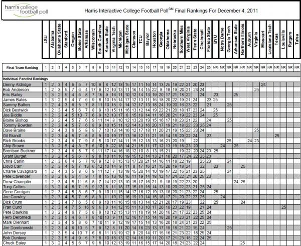
Looking at poll results and hearing about how your favorite team was ranked can seem confusing. There are a lot of busy tables for each poll every week with each voter ranking their favorite teams. Many people, me included, can be very visual with their learning styles. Because of this, a busy table, like the one below for the Harris poll, would detour someone from understanding where their team falls in the overall rankings. In this case, I can’t tell whether or not Oklahoma State is 2nd or 3rd without adding up all the entries.
By leveraging Tableau an interactive data visualization tool, I can import the poll data into the program and instantly have a visual I can interact with. Click in the dashboard below to explore.

Quickly, I can see with the visual on the left that Alabama received the majority of the 2nd place votes in the poll and Oklahoma State received the majority of the 3rd place votes. I can also see, with the visual on the heat map on the right that Oklahoma State and Alabama votes were spread out across the voters. Oklahoma State had votes from 2nd place to 6th place, while Alabama had votes from 2nd place to 4th place.
Using Tableau’s visualization tools, I can now quickly see a snapshot of what the final voting in the Harris poll was. I don’t know about you, but if I could look at something like this, I would never want to go back to looking at spreadsheets again.
Tableau allows you to create a report/dashboard, publish this report/dashboard, and allow end users to interact with the report/dashboard online without any downloads, plug-ins, or applications. With Tableau you can create interactive graphs, dashboards, maps, and tables from any data source, and interact with your data to effectively analyze and make decisions. No matter what business you are in, Tableau could be the tool to help you make more informed decisions across your company. This is just one example of what Tableau can do. For more examples click here.