
If you follow Tableau blogs frequently, you have likely seen dashboards that have icon-based navigation elements. In this post, we’ll walk through how to take that a step further by creating buttons that will change color and text depending on the state of other selections in the dashboard.
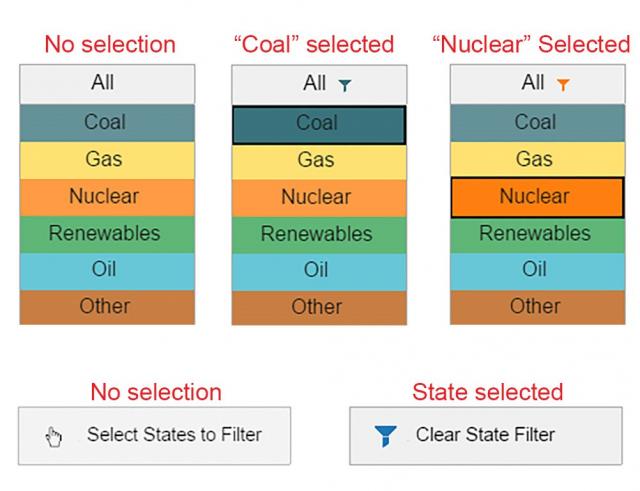
Below is an example from one of my dashboards, “A Decade of Electricity.” Notice how the filter icon on the All button appears and changes color depending on the fuel type selected. Likewise, the Select States to Filter button has a different icon and text once a state is selected from the map.
Making the Buttons
These aren’t technically “buttons” in Tableau. They are worksheets with text, accompanied by a mark with a custom shape. This post by Tableau Zen Master, Nelson Davis, offers a step-by-step explanation on making one. Here, I’ll expand on the same idea to change colors, shapes and text on the button. The screenshot below shows how to set up the worksheet. The axes are shown for reference only. You will need to right-click and uncheck Show Header to make them invisible.
There are three key differences from the linked tutorial on making this type of worksheet:
- I have added a dual-axis to enable a second “layer” needed to remove the black border when the icon is selected (discussed below).
- I’m using custom shapes rather than the shapes that are shipped with Tableau.
- I’m setting colors and shapes based on a field added to the Color and Shape shelves.
Controlling Colors and Shapes
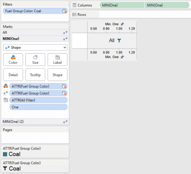
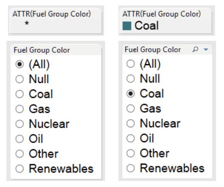
The important thing to notice here is the use of the ATTR() function on the Shape and Color shelves. Using it means that when we have more than one value to show, Tableau displays an asterisk (*) instead of listing individual values. We can take advantage of that to set a different color or shape for the asterisk and other values.
To set colors, drag the appropriate dimension onto the Filters shelf. Then, right-click and choose Show Quick Filter. On the color legend, you should see an asterisk if multiple values are selected and the dimension value when only one is selected. Now, you can click through each one in the quick filter and set the color by choosing Edit Colors from the color legend.
The process is the same for assigning different shapes for each filter selection. Step through the values in the filter and choose the corresponding shape from the Shape shelf. Later, you will see how to control the color and shape using dashboard actions instead of these filters.
Removing the Black Border When Selected
Certain shapes or icons won’t look their best when selected. Tableau draws a black border around custom shapes to tell users which marks they’ve selected. Normally, this is a feature we want. But on navigation elements, it can look unpolished.
This is where we need the dual axis to lend a hand. On one axis, everything is set up as explained above. On the second axis, we’ll use a custom shape that I affectionately call an “invisibility cloak.” I call it that because it is a 32×32 PNG file that has no content. It is fully transparent. You can make one of these with any popular photo editing software or download the Blank Shape.png file at the bottom of this post.
Since it is on the second axis, the user is actually clicking on this blank shape instead of the icon that is visible. The lack of any content in the image means that Tableau has nothing it can use to draw a border, so nothing changes when it’s clicked.
Changing Color and Text
Since our buttons are actually worksheets, we can control the content shown using filter actions on the dashboard. In the fuel selection menu example, a user would select a name from one worksheet that filters the values on the All button while also filtering views on the dashboard. If you’re unfamiliar with dashboard actions, this Tableau Knowledge Base article will get you started.
When the action filter is applied, the value changes from an asterisk to the value selected. Since different colors and shapes are assigned to each one, the button changes based on user interactions.
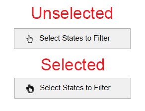
To change text, a calculated field is necessary. In this example, we’ll look at what happens when someone selects one or more states. Any time there are less than 50 states selected, I want the Select States to Filter to change the text and shape displayed. Here’s how to check for that in a calculation:
IF COUNTD([STATE])<50 THEN "Clear State Filter"
ELSE “Select States to Filter”
END
Since I am applying an action filter to this view when a state is clicked on the map, the navigation button will have fewer than all 50 states to count up in the COUNTD() function. By adding this to the Label, Shape and Color shelves we can alter the design using the same methods as above.
Deconstruct It Yourself
These are just a few of the things you can do with navigation buttons. If you wish to explore this method further, download the example workbook from Tableau Public and poke around. If you find a better way of doing it or have questions, please leave a comment below.