
When you are just starting out with Tableau it will often surprise you how easy it is to replicate tasks that might take hours in Excel but just moments in Tableau. While formal training is an excellent start to becoming an expert, sometimes you just need to crush out a quick report. InterWorks recently received the following Tableau question:
“I need to monitor KPIs. Some measures are % and others are general numbers. How do I get % and measure numbers all on ONE dashboard?”This is a common question when people are beginning to replace their old data tools. Creating something described above in Excel could take a dozen hours formatting data, combining functions, and formatting the results. Instead, Tableau can provide gorgeous, flexible, solutions in less than ten minutes.
In the attached Tableau Workbook file, you’ll find a basic dashboard and supporting worksheet, along with example crosstab sheets displaying multiple measures. Everything in the file was created using the sample Superstore Sales data that comes with Tableau.
KPI Chart & Calculated Field Formatting
The dashboard itself is just a basic KPI chart with a selectable measure (Profit or Profit Ratio) and a legend. Creating custom formatting for the shape labels between percentage and currency can be tricky though. In this case a calculated field had to be created for the label shelf:
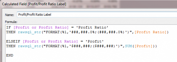
Since the data source in this instance is an Excel file, the formatting matches Excel’s format maps. (Thanks to Joe Mako via ‘DataViz Dude’ on Tableau forums) The same formatting can be accomplished using a STRING function with concatenation, but the above RAWSQL_STR function works better in this scenario since we have both positive and negative Profit.
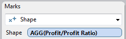
Profit Ratio is a calculated field that divides Profit by Sales per row. You can see the calculation used by right clicking the Profit Ratio measure and selecting “Edit…” from the drop box. The KPI chart can be duplicated by reviewing the pill locations on the shelves. The KPI shapes are assigned based on a calculated field “Profit/Profit Ratio” that returns a “Good”, “Great”, or “Marginal” result depending on the selected measure, either Profit or Profit Ratio. After placing the Profit/Profit Ratio calculated filed on the Shapes shelf, the shapes are assigned to each returned value (Good, Great, or Marginal) using the following process:
First, place the calculated field on the Shapes shelf on the Marks card:
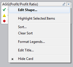
Second, click the drop down arrow in the shapes legend that appears and select “Edit Shapes…”:
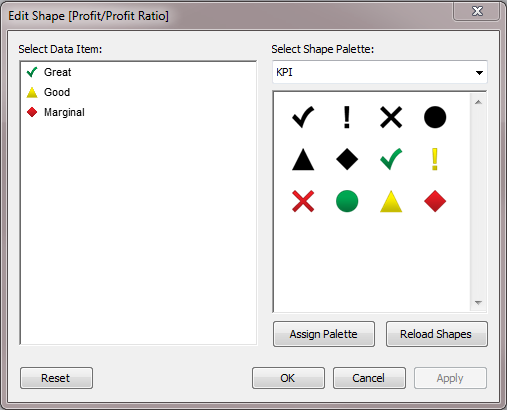
Last, select the drop down menu on the right and select the KPI shapes palette. Click each calculation result then assign a shape from the palette, when you are finished it should look like the following:
Crosstabs with multiple measures and formatting
Creating the crosstab sheets (the pages that look like Excel pivot tables) is as simple as double clicking dimensions on your data list and then the measures you would like to review. I created the ‘Multiple Measure Crosstab’ sheet by double clicking Product Category and Sub-Category then Region directly out of the Dimension window. Then I added a few Measures by double clicking Order Quantity, Profit, Sales, and my Profit Ratio calculated field. I moved Profit Ratio to the end of each Region’s section by simply dragging the header to the right of Sales. After some simple bolding in the formatting options, you have what looks like an Excel Pivot Table in Tableau. Alternatively you can drag the Measure Names dimension directly to the Filter shelf and specify which Measure Values you would like to include, then drag Measure Values onto whichever shelf you would like. An example of this method is on the last sheet in the workbook, ‘Pane Down Measures’.
Hopefully those of you new to KPI charts in Tableau will have a better understanding of what you need to get started making your own even more elaborate KPI charts! If not, don’t hesitate to reach out to InterWorks with any questions you have. It should be noted however that the KPI chart in the attached dashboard is not necessarily a good KPI chart, it simply demonstrates the calculation results and label formatting. For a great piece on KPI chart functionality see InterWorks’ own Ben Sullins post on reducing the visual noise in your KPI chart. Keep sending us your questions and stay tuned for more Tableau tips and tricks!