
Forecasting is a word that tends to get some interesting reactions from people I meet. The most frequent reaction I think I encounter is one of slight intimidation. Forecasting has a simple point – use history to predict the most statistically likely future. When it comes to understanding the model itself, we more often than not treat it like some weird voodoo magic concocted in strange super-nerd rituals.
While the super nerds do exist, this blog is intended to help shed some light on the sorcery of basic forecasting. Hopefully, it will assist Tableau users in understanding the forecasting feature available in Tableau since 8.1.
What IS forecasting?
The most basic explanation of forecasting is that today’s values of a measure are a product of its past values. Put another way, sales today is a product of some combination of sales yesterday and the day before that. This goes all the way back to the beginning of our data.
Forecasting is different from traditional linear regression where a dependent variable (y) is a product of one or multiple independent variables (xn). Additionally, forecasting models can account for things like seasonality. This is just what you would think. It’s data that follows some type of seasonal pattern, like sales spikes in November and December every year because of the holiday season.
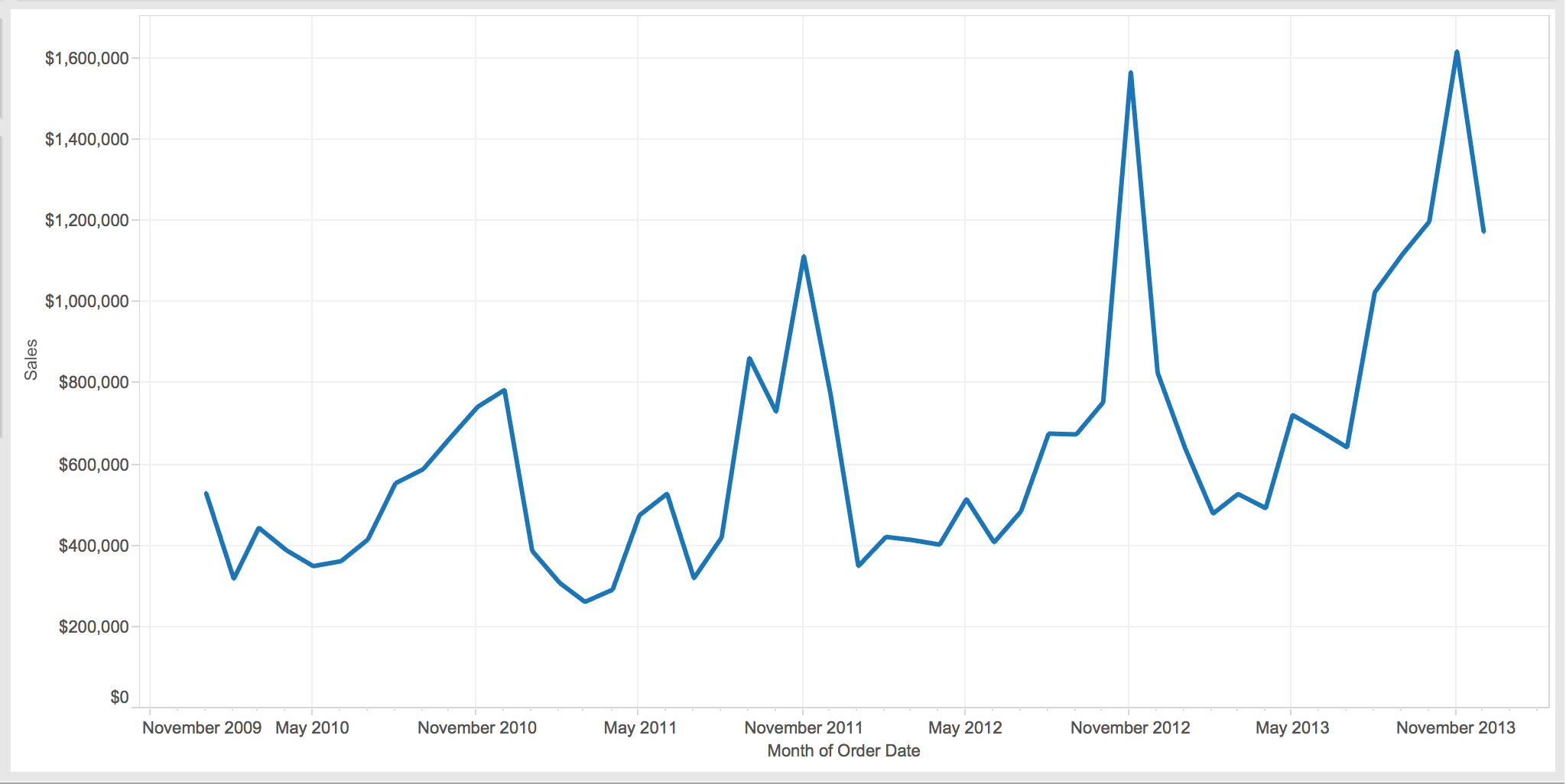
Above: A basic example of graphed sales data.
Generally speaking, there are two main types of models that are built for time series forecasting: ARIMA models and Exponential Smoothing (ES) models. Exponential Smoothing models were developed in World War II as a way of getting the best one-step-ahead forecast. They essentially take a weighted average of past values to come up with a prediction for tomorrow, putting more weight on the most recent observations. This approach can be very powerful and is still used today, especially when accounting for things like trend and seasonality.
ARIMA models (Autoregressive Integrated Moving Average) incorporate a slightly different approach. ARIMA models can also account for things like seasonality and trend. Rather than relying on weighted averages, they look largely at autocorrelations. These autocorrelations are the correlation between individual values in the past and the present value. You may have guessed this already, but some ES models are actually special cases of ARIMA models.
With overlap in the two approaches, one of the toughest questions is: “Which approach do I use?” Typically, you use the one that works the best! However, you need to ask yourself one very important question: “Do I care more about prediction, explanation or both?” If you want to try and explain why a forecast is the way it is, you need to use ARIMA models to really get at more statistically sound answers. Otherwise, you’re free to use either.
Another caveat – if you want to use other variables to predict a future value of something (i.e. we’re not only going to use previous values of sales, but also previous values of total employees to predict future values of sales), then you are limited to ARIMA models (known in some circles as ARIMA-X models).
Some Practical Principles:
Ok, enough of the theory. You want to know things to watch out for, so here’s a short list of some high points:
- Data, Data, Data – Like with most advanced analytics, you need lots of data to really get a good forecast. This is especially true when you’re looking at data with seasonality. Holding out data from your models in order to validate your model is absolutely necessary. There are different perspectives on how much data to hold out, but the 80/20 rule can be effective here. Use 80% of your data to build your model and 20% to validate it. Typically, if your data shows seasonality, you need to hold out a sample that is at least one season long.
- Define Your Purpose – Consider why you think you need a forecast model. Is it to better predict and anticipate the future? Is it to explain the past? These questions can potentially limit or expand the techniques available to you and need to be answered before you start.
- Plot Your Data – Look for things like seasonal structures and overall trend. This will help you visually get an idea of what is happening in your data and help you better design models. Tools like Tableau can be very helpful here in getting at your data to see what you have.
- Beware of Assumptions – Don’t blindly accept things. One needs only to look at the assumptions that were underlying models built before the collapse of the housing market in order to understand how important this warning can be.
- Statistical Scrutiny – I would highly recommend enlisting the help of someone with statistical training to help you create and implement your forecast model. While this blog is an attempt to help shed some light on the black box, it is not all-encompassing.
There’s a lot to digest in the world of forecasting. It’s a field that is very dependent on the data and the situation. Sometimes, there isn’t always a right answer. There’s only a best answer.
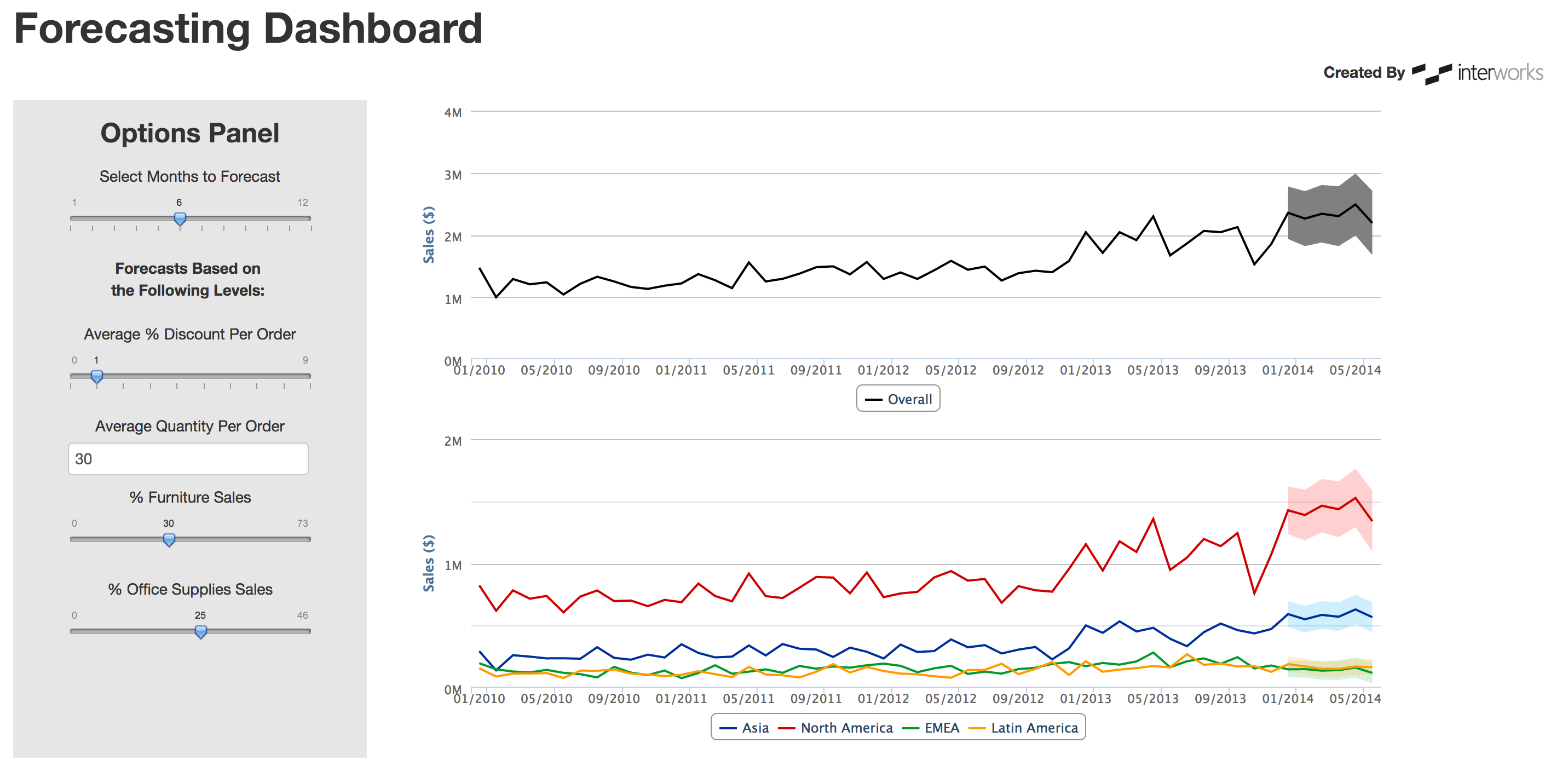
Above: An example of a forecasting dashboard made with R and Shiny.
Forecasting in Tableau
Since the release of 8.1, Tableau includes a forecasting tool that is available when viewing time series data. Now that you know a little more about the basics of forecasting, you will hopefully be able to better understand what Tableau is doing in the background.
Tableau’s forecasting tool uses Exponential Smoothing models to develop a forecast. Again, this means, in simple terms, that the forecast is the result of a weighted average of its previous values. Tableau also automatically tries to detect any seasonality and trend, adding these to the model. However, Tableau looks for seasons that are most likely to occur with the time period type that you are using. For example, if you’re plotting time in months, Tableau looks for 12-month seasons. If you’re looking at days, Tableau looks for a weekly season. This approach will cover most of the seasons that one encounters but will miss the rare times when a season has a length of something like five months. Tableau will probably not detect that season at all.
To really dig into the details about forecasting in Tableau, consult Tableau’s Online Help.
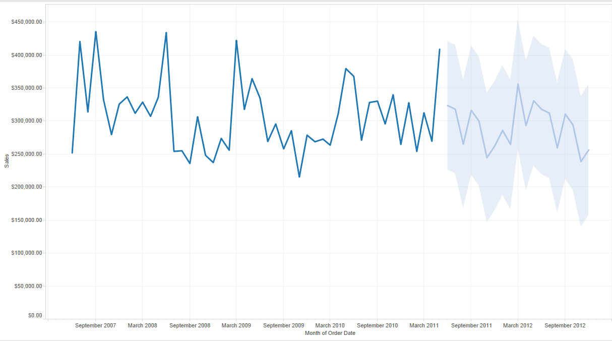
Above: An example of forecasting in Tableau.
Generally speaking, the Tableau forecasting feature is a good way to explore the data you have and to get a ballpark idea about what your data is saying. However, I would strongly advise against just clicking Show Forecast and not digging deeper into your data. You can get more information about the performance of the model in Tableau by clicking Describe Forecast in the Analysis Menu. You will see some common fit statistics for forecasts there. One of the most widely used is MAPE (Mean, Absolute, Percentage, Error), which is a comparison tool to evaluate forecasts. Here’s the simplest rule: the lower the MAPE, the better when comparing models.
Further Resources
Hopefully, all of this will eliminate a little bit of the mystique behind forecasting. There’s a lot to forecasting, and one blog isn’t going to explain it all. If you’re interested in forecasting, you need to take the time to learn more. One of the better resources out there for further reading and learning is “Forecasting Principles and Practice” by Rob Hyndman and George Athanasopoulos. See the online version of their book here. If you’re like me, you’ll want to order a hard copy of the book. Professor Hyndman actually helped Tableau develop their forecasting tool, and their book is a great read for anyone interested.
There’s More?
I’m sure you can imagine that there are tons of applications not only for forecasting, but for a wide variety of advanced analytics techniques. Stay tuned for some more blog posts about forecasting (remember that ARIMA-X I mentioned?) and other techniques that may bring value to your company.