
The 2016 golf season is starting to pick up speed. In just a couple of months, the first major of the year, The Masters, kicks off at Augusta and with it the race for the FedEx Cup.
Being a golf nut, I’ve always wanted to create a visualization of PGA Tour stats. Thankfully, PGA.com has some impressive stats that are incredibly easy to get – no Python or Web Data Connector needed. Just the handy copy/paste into Excel does the trick.
Looking at the data, I wasn’t satisfied with just seeing numbers or bars of a PGA pro’s average shot off the tee. I felt the story wasn’t being told the right way. I wanted to recreate at beautiful parabola shape that happens when they bomb one down the fairway over 300 yards.
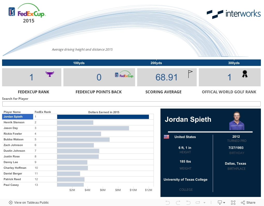
Here’s the end result:
But how do we get Tableau to draw that parabola?
I turn this next bit over to Tableau Zen Master and fellow InterWorks analytics consultant Robert Rouse to show you how he made Tableau draw that beautiful arc of a golf ball in flight.
Visualizing the Arc
Our first idea was to draw curves based on the physics of golf ball flight. Those discussions turned out to be academic since we lacked necessary data like initial velocity, course conditions, and other variables. Plus, we’re only showing averages so true flight paths are less meaningful.
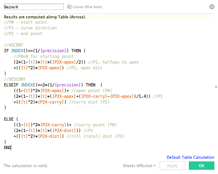
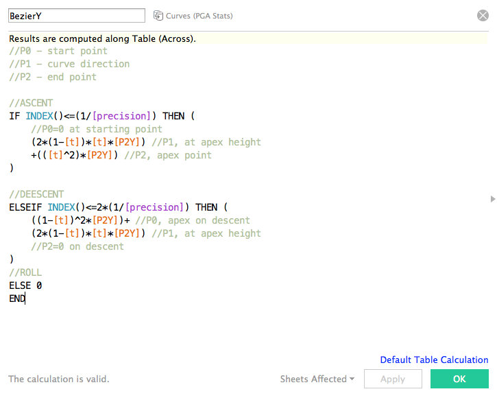
Instead I approached the problem by thinking of how to draw smooth curves given three data points: apex (distance and height), carry distance, and total distance (carry+roll). The key was to draw three line segments which intersect those points and are tangent to a horizontal line at the apex. This basically describes a Bézier curve – three of them, to be precise.
I first saw this done in Tableau with Chris DeMartini’s hive plots, and borrowed much of the math from that. We start with the formula for quadratic Bézier curves:
![]()
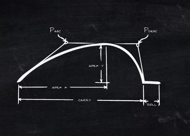
If you aren’t familiar with these curves, the Wikipedia article includes some very helpful illustrations and explanation. The diagram below shows at a high level how Bézier curves help us draw gold ball flight paths:
I’ll spare the algebra lesson on how we applied the Bézier formula at each point and instead show the main resulting calculations in Tableau for the X and Y values:
Using the Arc in Analysis
So, with Robert’s calculated field magic, we’re able to look at each individual players stats for the 2015 season and see how their average drive looks compared to the field. Notice how #1 ranked golfer Jordan Spieth doesn’t have to crush the ball. He’s actually fairly short off of the tee (Avg 295 yards) compared to ball smashers like Dustin Johnson (Avg 319) and Bubba Watson (Avg 317).
It just goes to show that just because you can impress people on the driving range with that huge drive, it doesn’t mean that you’re going to win in the PGA. Spieth is not only the top earner for the year, but also won the 2015 Masters, U.S. Open and came in 2nd for the Open Championship in the UK.