
Many of us embed visualizations in our websites, and they likely look great on our own monitors, but what about on your boss’s giant, 28-inch iMac monitor? How do they look on a projector? How do they look on an iPad?
In today’s world of varying screen sizes, we find ourselves in a difficult position trying to design dashboards to fit all needs. The rest of the internet can change responsively, so why can’t our embedded dashboards?
Luckily, with some nifty JavaScript (and a few options on the Tableau side), our dashboards can be as fluid as our websites. This tutorial assumes a basic knowledge of the Tableau JavaScript API, but if you have not used it already, Tableau has a great tutorial for getting started.
How It’s Done
I’ve attached an example, so feel free to dive into that now if you feel comfortable. If you’d like more information, let’s run through the pieces.
On the Tableau Desktop side, setup couldn’t be easier. Simply make your dashboard sized to Automatic or Range with a minimum sizing based on the aspect ratio you’d like to keep as it scales up. We usually use a range with a minimum size and no maximum size. Whatever you do, make these sizes match the JavaScript sizing you setup.
For the JavaScript side, you’ll need to do some programming – but it couldn’t be simpler! The example is built in jQuery, but if you are using a different JavaScript library, feel free to substitute out the various functions for whatever you need.
First, we need to create a function to determine what the size of our dashboard should be. This can be as complicated or simple as you need. For my website, we would like to have no scrollbars when the user views the dashboard on a screen size big enough to meet our minimum specifications. Thus, we need to take into consideration the header and footer of the website. Using jQuery’s $(‘body’).height command, we can grab the height of the user’s browser window. To account for the header/footer, I’ve subtracted 100 pixels. I’ve also created some minimum dimensions, so that our dashboards do not shrink into oblivion. For the width, we simply calculate out a number based on the height. This keeps our aspect ratio the same.
/**
 * Finds the correct size of the dashboard in this screen.
 */
function findDashboardSize() {
	var minHeight = 630;
	var maxHeight = 885;
	var minWidth  = 1000;

	// The minus 100px leaves us room for the header/footer. Adjust as needed.
	var height = $('body').height() - 100;

	if (height < minHeight) {
		height = minHeight;
	}
	if (height > maxHeight) {
		height = maxHeight;
	}

	var width = Math.round(height/(minHeight/minWidth));
	return {
		'width'  : width,
		'height' : height
	}
}
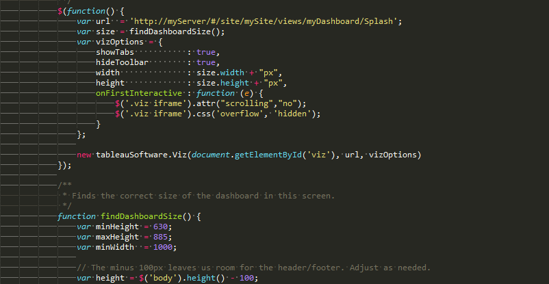
Next, we need a function to run on the page load to instantiate our visualization. This function will call our previously built function findDashboardSize() to get the correct height and width dimensions for our dashboard. It also adds some code to remove scrollbars from the embed iframe. They tend to popup randomly in some browsers without this code.
/**
 * Instantiate our vizualization.
 */
$(function() {
	var url  = 'http://myServer/#/site/mySite/views/myDashboard/Splash';
	var size = findDashboardSize();
	var vizOptions = {
		showTabs           : true,
		hideToolbar        : true,
		width              : size.width + "px",
		height             : size.height + "px",
		onFirstInteractive : function (e) {
			$('.viz iframe').attr("scrolling","no");
			$('.viz iframe').css('overflow', 'hidden');
		}
	};

	new tableauSoftware.Viz(document.getElementById('viz'), url, vizOptions)
});
Finally, we have one remaining task: We need to attach to the resize event fired by JavaScript in order to resize our visualization if the user resizes their screen after the initial page load. jQuery makes this extremely easy. We simply create a function to change our div and iframe container size, and then call $(window).resize(resize) to attach to the resize event.
/**
 * Resizes our viz.
 */
function resize() {
	var size = findDashboardSize();
	$('#viz').width(size.width);
	$('#viz').height(size.height);
	$('#viz iframe').attr("scrolling","no");
	$('#viz iframe').css('overflow', 'hidden');
	$('#viz iframe').width(size.width);
	$('#viz iframe').height(size.height + 20);
}

/**
 * Hook into the window resize event to resize when the user resizes the screen.
 */
$(window).resize(resize);
And there you have it! Quick, simple, responsive embedded dashboards using Tableau. All you need to do now is create some content!
The Latest
-

Fabric Governance: Users, Licenses, Roles and Capabilities
17 April, 2024 -

Matillion Hub Insights
16 April, 2024 -

Exploring Tableau Pulse To Replace Traditional Dashboards
15 April, 2024