10 Questions is an ongoing blog series in which Tableau Zen Master Dan Murray interviews some of the brightest folks in the world of data.
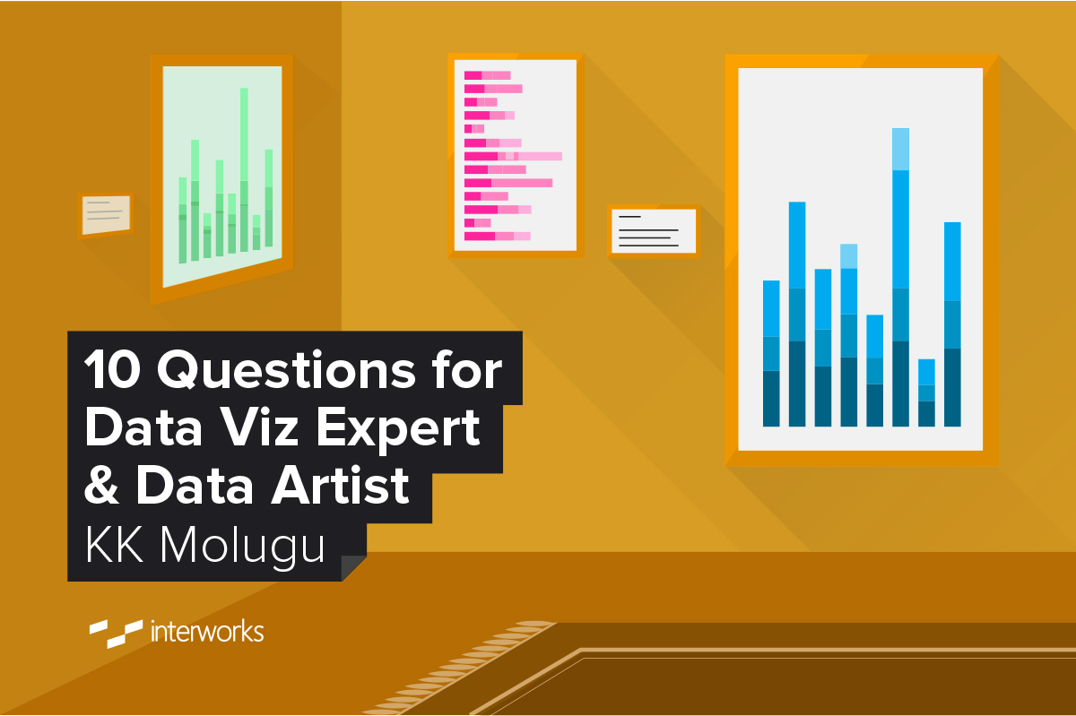
I first became aware of KK about a year ago through his interesting Tableau Public visualizations and his activity on Twitter. Earlier this year, I was fortunate to speak with him at an event in Chicago and was able to spend 90 minutes eating lunch and chatting about data visualization, Tableau and data in general.
His speaking style in front of an audience reflects his personality perfectly – open and genuine. KK’s data art is appealing and reflects his curiosity and aptitude for learning. KK is one of the many reasons that I love the Tableau community.
The Questions
Q: Describe your background.
Molugu: Getting an education in electronics engineering and computer science enabled me to start my technology career as a programmer. I’ve built client-server applications, web applications and custom software solutions for a variety of industries in the last 15 years. I’m focused on building applications that enable and empower business users with simple user interfaces.
As my career progressed, I gravitated towards marketing and data analytics. After getting my MBA, I moved into marketing to manage R&D and data analytics. During my marketing and data analytics tenure, I came across a lot of data (good, bad and ugly), which opened up a lot of opportunities to tell stories. That’s what I’m doing now.
Q: When did you first become aware of Tableau, and what was your first success with the tool?
Molugu: A little web surfing led me to discover Tableau. Within few minutes, I was able to download and install the software. After couple hours of tinkering and few basic videos on the Tableau site, I built a very slick visualization map showing all our customers by ZIP codes with different colors.
That was a proud moment. And at that moment, I realized the potential of Tableau and how it would help different businesses. I could hear “hallelujah” at a distance.
Q: What was your first success with Tableau?
Molugu: My first interaction with Tableau was by accident. A couple years back, I was tasked to present a report on our energy customers across multiple utility territories for senior management team.
With my programming background, I built a few charts with different technologies, i.e. Excel, MapPoint, Google Maps, etc., and I was not convinced this would add value to the users.
My first success with Tableau at work was building a customer survey analytics dashboard for our Customer Operations team that enabled them to visualize survey analytics over time.
In the Tableau Public world, my first success was the RunViz – Chicago Marathon Analytics for 2014. That Tableau User Group Contest was one of the three winners!
Q: Your Tableau Public account has some interesting dashboards reflecting interests in running, art and data. What inspires you to build these in your off hours?
Molugu: I took up running pretty much the same time I encountered Tableau. When I first started running, I had few questions:
- Does age have any impact on running?
- Which countries are participating in various marathons, and who is winning?
- Does weather have an impact on running?
With these questions in my mind and having Tableau at my disposal, I just started playing (I don’t call it work anymore, it’s pure play) with the data.
At the same time, Tableau announced Tableau User Group Contest, and I decided to answer my questions and participate in the contest. I started out with few dashboards and got great feedback from Jeffrey Shafer and the Chicago TUG. Then, I used their feedback to refine my design, and the rest is history.
After RunViz, I realized that participating in these Tableau Data Challenges is the best way to learn Tableau, showcase my work and possibly win something! Data challenges helped me utilize my curiosity to take my Tableau skills to the next level.
A few months before DATA14, I wanted to design a background image for my Google+ account. Being a data geek, I wanted to use Tableau to build the image. That’s when I realized that it’s possible to create art with Tableau. I have an interest in art, but never had the fingers to paint something. And guess what: Tableau had an answer for that and filled that void as well.
*Tableau + Data Art = Data Therapy.*
When Tableau published #VizAsArt contest for DATA14, guess what I did: I threw my hat in the ring, and one of my artworks, #landscape, was one of the top three winners!
You can check out Tableau’s Think Data Thursday Webinar where I talked about “becoming a data artist!”
Q: What’s your job, and how do you utilize Tableau?
Molugu: I work at SouthStar Energy Services, a subsidiary of AGL Resources Inc., managing the Data Analytics group. One of my responsibilities is to bring insights from data to the business users with data analysis and analytics.
We utilize Tableau for data discovery and form building visualization reports and data analytic projects for the company. I am also spearheading a Data Visualization Center of Excellence at SouthStar. Paul Banoub from UBS has been my mentor for this effort.
I have also conducted a few internal training sessions to build a self-service data analysis process that enables/empowers business users to answer most of their questions without going to IT or even my team. I strongly believe that user empowerment can be achieved by giving them access to the data and providing them with tools like Tableau.
Q: How do you view data governance in work environments where Tableau is widely deployed?
Molugu: Data is one of the most valuable assets for every company and can be used to create a competitive advantage in the industry. Data governance is needed in every organization so value is not compromised and left open for abuse.
Proper data governance encompasses collecting data, building insights and using the same data. Data governance does not mean defining restrictions on data and hindering accessibility to business users.
With Tableau being widely deployed for analysis and reporting, both business and IT groups can work with each other to build data sets and make them accessible to the users. This has many benefits to the organization, like building a single source of truth, defining governance, controls and ease of maintainability.
Q: What design tactics do you employ to scale visualizations and dashboards to larger data sets while improving load speed and query performance?
Molugu: No one likes to see the spinning beach ball or the rotating circle when waiting to view amazing visualizations in Tableau. To avoid the “it’s still thinking” frustration by the users, we have to consider a few best practices when building Tableau dashboards:
- Understand what you or your users are asking for.
- Make sure that the data is in its most granular nature for analysis.
- If data is coming from relational databases, make sure we have the right indices and optimize the data model.
- If the performance seems really slow, try to run the same query in the database to understand the issue
- Minimize lot of worksheets in a single dashboard
- Start with a story and slowly weave all details into additional dashboards. Too much information is not always good, and keep it simple.
And, Tableau 9.0 is going to deliver additional query performance improvements.
Q: What inspires you about the Tableau community?
Molugu: The Tableau community is one of the greatest communities that I have come across in my experience. It is a bunch of passionate individuals who are Tableau and data enthusiasts, or Tabaholics, and they have common goals “to solve a problem” and “help others.” That inspires me, and I am glad to be a part of this journey.
I would like to send a quick shout-out to some of the Tabaholics who inspired me in some shape or form: Andy Kriebel, Anya A’Hearn, Dan Murray (you), Joe Mako, Jonathan Drummey, Kelly Martin, Matthew Lutton, Paul Banoub and on and on.
Q: Why aren’t more database professional as passionate about Tableau as you?
Molugu: I don’t know if I can say that they are not passionate about Tableau, but I can say that they have not seen how Tableau can be leveraged to help them in their job.
Most of the technical members think Tableau is just another tool that will create “jazzy” graphs and is meant for business users. Once they understand the “context” on why and how the data is being used and the ultimate value of the report and/or the analysis that Tableau brings, I am sure they will just love Tableau.
Q: What do you hope to see happen with the design of Tableau over the next few years and why?
Molugu: Tableau can do quite a few things with the way it is now, and we are seeing some amazing features coming in 9.0. I would love to see more technical features that would enable me to deliver more information to a wider audience:
- User-Defined Functions (UDF) – I see myself writing similar calculated fields multiple times for different projects. Having the UDF will eliminate that, and we can also open Crowd Development and share. Build once and use multiple times.
- Configuration Management – As Tableau workbooks are XML style-based files, I would love to see if we can manage some of the workbook configuration from the workbook itself instead of hacking the .of files. These are few and opens up a lot of possibilities like color palette sections and database/data source connectivity.
Bonus Q: Do you think a technical background helps or hurts one’s ability to create beautiful and informative dashboards and visualizations?
Molugu: In my opinion, having a technical background helps one create more beautiful informative dashboards and visualizations. To be a successful data analyst or data visualization analyst, you don’t need be an expert, but it helps to have some understanding in these areas:
- Technical expertise – be able to know how to get the data and manipulate it easily
- Business or domain knowledge – what is the purpose
- Communicate and present the data – can we convince someone?
Whether you have knowledge in these areas or not, you MUST have passion to play with the data.
Discover More Interviews
Want to read more insightful interviews like this one? Then you’ll love our 10 Questions blog series. Check out the full list of interviews here, and stay tuned for new additions.
Need Help? Let Us Know!
There you have it. If you need help with your data infrastructure or Tableau, we have the experience, skill, and knowledge to insure your success. Contact us today to learn more.
If you’re in college and think you might want to get into this game, head to our Careers page and apply for one of our open jobs. We’d love to hear from you.
The Latest
-
Kickstarting Data Innovation in Healthcare
18 April, 2024