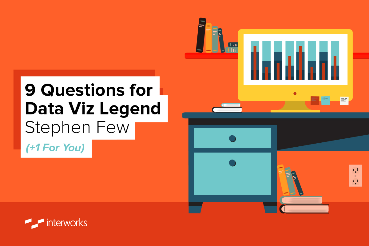
My career path was illuminated by Stephen Few. Eight years ago, I was looking for a solution to a problem. Stephen’s advice led me to Tableau. His books have been foundational in my understanding of effective communication through data visualization. Edward Tufte’s books are entertaining and informative. Few’s books are practical, how-to (and how-not-to) guides. Critical of bad visualization techniques and expedient* marketing ploys, Stephen always explains “why” and offers a better alternative. Keep an eye open for his next book.
*Ex·pe·di·ent
Hastening or forward; hence, tending to further or promote a proposed object; fit or proper under the circumstances; conducive to self-interest; desirable; advisable; advantageous; – sometimes contradistinguished from right.
This post provides a classic example of his teaching style. Building effective dashboards is hard work. Space and attention are limited. I challenge you to find a combination of charts that communicates more in less space than Few’s Bullet Graph and Tufte’s Sparkline.
All of the links in this post were added after the fact without consulting Few. The aim was to provide links that facilite your own investigation into a topic or person of interest.
The Questions
Q: When did you get started in data visualization and why?
Few: I worked in the fields of data warehousing and business intelligence for many years before I began to focus on data visualization. Until I attended Edward Tufte’s one-day seminar in 1998, I had no-better-than-average data visualization skills. In other words, I knew where to click with my mouse to get a chart to appear in Excel but little else. After attending Tufte’s seminar, I realized that the principles he taught for effective data visualization were known by few and that no one seemed to be teaching these principles in simple and practical ways to the people who needed them most.
Five years later, as this realization became increasingly stark and painful, I eventually decided that I should do something about it. That’s when I decided to read everything I could find about data visualization, practice what I was learning and then write my first book, “Show Me the Numbers,” which was originally published in 2004.
Q: Who were your early influencers? How did they inspire you?
Few: Edward Tufte was my first and foremost influencer in the beginning. Once I began to study data visualization in earnest, I soon discovered the work of others, including William Cleveland, Stephen Kosslyn, Colin Ware, Gene Zelazny, Robert Harris and Robert Horn. It was on the shoulders of these men whose work preceded mine that I attempted to stand when I wrote my first book. I tried to distill their knowledge into a comprehensive yet simple, accessible and practical introduction to data visualization that didn’t already exist at the time.
Q: Do you think that useful data sensemaking requires a combination of analytical and artistic skill?
Few: I can’t answer this question without first knowing what you mean by “artistic skill.” This is a term that is often used and rarely defined. If by artistic you mean creative, then the answer is a definite “Yes.” If by artistic you mean the ability to create works of visual art, such as exquisite paintings or drawings, then the answer is a definite “No.” I have colleagues who refer to me as an artist, but I always object when they do because I don’t approach my work as an artist but as a scientist. I base my work on empirical evidence of the practices that work and an understanding of how and why they work.
Q: Do you think database experts typically make good data sensemakers?
Few: I’m not sure that there is any particular information technology role, including “database experts,” that correlates to good data sensemaking. Instead, I’ve found that there are particular traits that are typical among skilled data sensemakers. Here are a few:
- Curiosity
- Persistence
- Self-actualization
- Creativity
- Critical thinking
- Skepticism
- Analytical (the ability to deconstruct things into their component parts)
- Synthetical (the ability to connect the dots, to see how things relate to one another and work together)
- Honesty
- Good communication
Another trait that I suspect is shared by most good data sensemakers is introversion – people who prefer to work alone, quietly exploring data, and are comfortable spending long hours in silence communing with data, weaving it into something meaningful and useful.
Q: What should a young person interested in working in data sensemaking study in college? What kinds of reading, internships, training would provide the necessary foundation?
Few: I don’t think it matters much at all what a young person studies in college to prepare for a career in data sensemaking. In fact, I recommend that young people interested in this career study broadly, getting a good general education with exposure to many fields of study. What does matter is that in the process, they develop good critical thinking skills and become versed in the scientific method and statistics, at least at a basic level. Few of the skilled data sensemakers that I’ve met pursued university studies in fields that were directly associated with information technology. Case in point, my undergraduate degree was in communication studies and my graduate degree was in comparative religion. Along the way, I learned to think.
I recommend that young people (and old alike) read whatever interests them. If you love to read, and read because you love to learn, you will gravitate to written works that build your mind just as exercise builds your muscles. My reading interests are eclectic and evolving. Obviously, I read about data visualization, analytics, neuroscience and statistics, but I also read whatever grabs my interest. I always have at least one or two non-fiction books going and a novel, as well.
Expertise in any skill comes from digesting the right information in a way that leads to understanding and practice, practice, practice. Anyone who wants to build a career in data sensemaking must find opportunities to do the work of data sensemaking. Organizations of all types need people to make sense of data. Find a job that lets you examine and communicate data to some degree, do it well and then use that as argument that you should be doing more of it. Every opportunity that I’ve had to do the work of data sensemaking was one that I created by proving myself and then proposing a new role for myself that involved some aspect of data sensemaking that interested me at the time.
Q: How long should it take for more experienced people in the workforce to acquire the necessary skills to improve their data visualization and data sensemaking skills?
Few: One minute. I suspect that you didn’t actually ask the question that you meant to ask. It only takes a minute to improve one’s data visualization and sensemaking skills to some degree. Perhaps you meant to ask how long it should take to improve these skills to a particular level, such as to the level that’s required to get a full-time job doing this kind of work. Even that question can’t be answered, however, because it depends on the degree to which the person doing the hiring understands what’s required. There are many people with job titles like data analyst, business intelligence professional or even data scientist who don’t know the first thing about data sensemaking or data visualization.
Let me respond to the gist of your question in a way that makes sense to me. Anyone with experience in the workforce who is truly interested in data sensemaking and data visualization should rest assured that they can develop these skills within an acceptable amount of time if they’re willing to put in the effort. Yeah, I know I didn’t really say anything definitive, but I did say something helpful. Unlike some skills that only people with exceptional intelligence and talent can develop, data sensemaking and data visualization skills can be developed to a degree that would benefit an organization by anyone of average intelligence or better.
Q: Do you see evidence that journalists are becoming more accomplished at data visualization? Are infographics getting better? More informative?
Few: Some journalists are getting better at data visualization and are producing better infographics. My friend Alberto Cairo who wrote “The Functional Art” has had a hand in this. Most are not, but this is also true of people outside of journalism who visualize data. This is because most of those who pursue this work don’t take the time to learn the skills. They just jump in and do whatever appeals to them, which is usually ineffective.
The software vendors that produce the tools that we use to visualize data have a great deal of responsibility for this. Most of them don’t possess data visualization skills within their organizations, so they produce poor tools and promote bad practices. Eventually, the tide will change and effective practices will become much more routine. But so far, this change is occurring slowly and haltingly.
Q: Do you think that the technology industry (in general) understands data visualization and data sensemaking?
Few: Most of the information technology industry doesn’t have a clue about data visualization in particular or even data sensemaking in general. They seem to think that they can be experts in technology without being experts in the skills that technologies are meant to augment. They promote “technological solutionism” rather than the truth that technologies can only augment our thinking; they cannot do our thinking for us.
Q: Are you optimistic about the future of data visualization as the tools become more accessible to (non-IT) information consumers?
Few: My optimism or pessimism about the future of data visualization has nothing to do with the tools becoming more accessible to non-IT information consumers. Whether people are in IT or any other department has no bearing on their potential ability to benefit from data visualization. Plus, your question assumes that data visualization tools are becoming more accessible. I’m not convinced that they are. Software vendors have been marketing the improved accessibility of their tools for many years. Each new release of a product is the one that will supposedly allow data sensemaking to spread to the masses.
This hasn’t happened, however. None of the tools are yet doing a great job of supporting data visualization. Even the best tools are clumsy, overly complicated and plagued with useless and harmful features. Even if this weren’t the case and the tools were great, they would only be accessible to more information consumers if those consumers were trained in the requisite skills. This isn’t happening, in part because the vendors are promoting the myth that their tools are so great that anyone can use them without training. I’m not talking about training in using the tools but about training in the basic concepts, principles and practices that one must know to make sense of and communicate data.
A 10th Question for the Reader: Can you post a comment about how Stephen’s work has advanced your knowledge and/or changed your career path? Or, tweet about it using #10Qi.
Discover More Interviews
Want to read more insightful interviews like this one? Then you’ll love our 10 Questions blog series. Check out the full list of interviews here, and stay tuned for new additions.
Need Help? Let Us Know!
There you have it. If you need help with your data infrastructure or Tableau, we have the experience, skill, and knowledge to insure your success. Contact us today to learn more.
If you’re in college and think you might want to get into this game, head to our Careers page and apply for one of our open jobs. We’d love to hear from you.


