
Every decade, I spend a few weeks planning the next 10 years. This thinking normally encompasses career and investment goals. This time, I decided to expand my time horizon. I’m 57 years old, so I wanted to start thinking about what my personal financial situation looks like in 10–20–38 year time horizons. Why 38 years? Well, my father managed to live till he was 94 years old. I figure that I’ve got a good shot at making it to 95. My investing started in the mid–1980s.
The Rule of 72
If you save and invest wisely, it’s possible to accumulate a decent nest egg. The Rule of 72 provides a short-cut method for determining the number of years it takes to double your money for a given interest rate. For example: If you believe that you can earn a 6% return, the Rule of 72 says that your money will double in value in 72/6 = 12 years. If you maintained that 6% return on investment over your entire working life (67–22 = 45 years), that implies that you will double your money 3.75 times. Suppose you won $100,000 in the lottery at age 22 and invested that money earning a 6% return. Your money would grow as follows:
- 12 Years: $200,000 (age 34)
- 24 Years: $400,000 (age 46)
- 36 Years: $800,000 (age 58)
- 48 Years: $1,600,000 (age 70)
If you wait until age 70 to start collecting your social security benefit, you’ll maximize the monthly payment from the government. So, $100,000 at age 22 grows to $1,600,000 by age 70 without putting in another penny. Ah, the magic of compounding. These are nominal dollar amounts (not adjusted for inflation), so $1.6 million in 2064 won’t have the spending power that $1.6 million has today (unless we experience monetary deflation). If you are smart and take advantage of your company’s 401K plan or some other tax-sheltered savings plan, you can accumulate much more over your working life, and you’ll need to.
How Tableau Can Help You Invest
In this blog series, I’ll take you though some ways you can use Tableau to analyze the stock market, calculate returns, track investments and build a portfolio with variable expected returns so that you can create a retirement plan that suits your lifestyle.
Using Tableau to Measure the Market
How can Tableau help you analyze the stock market? I used some data that I downloaded from Yahoo Finance on major stock indices to get on where the market is today and what the return rates have been over the past 10+ years using table calculations to derive a compounded annual growth rate (CAGR) for various time periods. Figure 1 shows a time series chart for the S&P500 stock index.

The chart shows you the trend over the past 30 years. If you’ve been using Tableau for any period of time, you know that this kind of view is very easy to build. Pick a date and then a measure and select Show Me. Tableau will create a time series line chart.
I wanted to look at several major stock indices in this same view, so I downloaded index data from Yahoo Finance for the Dow Jones Industrials, the S&P500, the Russell 2000 and the Nasdaq. All of these files came down as text (.csv). I put them into a single folder and used the Tableau UNION feature in V10.0 to join them all together into one big file. This allowed me to create a filter instead of having to resort to building a parameter to select. The steps required for the UNION:
- Download the text files (.csv) into a folder (find the files attached at the bottom of this post)
- Open Tableau and pick one file from inside the folder
- Remove the single file from the data source drop-here area
- Drag the New Union option into the drop-here area
- Drag all four .csv files into the New Union and click OK.

You should see a sample of the first 1,000 rows of the stock data in the lower half of the data source screen. Because I chose to download daily stock data going as far back as 1059, I chose to exact the file after doing the UNION to improve the load speed and compress the source data.
What is CAGR?
Regular time-series data is useful, but I wanted to add rolling three-year, five-year and 10-year compound annual growth rates to the tooltip so that I could see those figures for any specific date. This was easy to accomplish using table calculations. A simple average percent change would overstate the actual return figures. Using a CAGR calculation is more accurate. Investopedia provides good definition of CAGR.
CAGR provides for an annualized compounding of the interest rate which will be a bit lower than a simple average.
The CAGR Table Calculation
By using the LOOKUP, ZN and POWER functions, it was easy to create CAGR calculations for three, five and 10-year periods. Here’s an example of the formula for the three-year CAGR formula:

The LOOKUP function tells Tableau where to find the first period that will be compared to the current period. I assumed that the markets were open 252 days/year. The POWER function is raised by 1/3 for a three-year CAGR. The ZN prevents formula generating a NULL result by making NULL values zero.
Once I finished that, I decided to add a lookup formula to display the close amount for both the three-year-ago figure and the current date closing index amount. I added the other formulas by duplicating the three-year CAGR formula and altering the amount for the other time periods. I then added the results to the marks card and edited the tooltip to display the CAGR calculation results and the comparison close figures.
By adding this data to the tooltip I can view three different CAGR calculations related to the current close date. Roll your mouse over any date and you’ll see the related CAGR values for that date. If Tableau doesn’t have enough historical data to make the computation, no value will display.
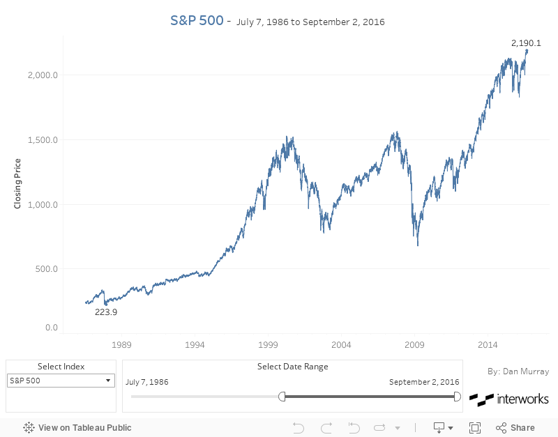
Tableau makes these kinds of enhancements fast and easy to do. If you’re really ambitious, you could create a web data connector for Yahoo finance and automate the collection of the index data or information for specific stocks you want to follow.
In the next post in this series, I’ll create a different kind of time series chart with Bollinger Bands that creates weighted average tracking values for any time period you desire.