
Have you ever wanted your scatter plots or quadrant analysis charts to be centered instead of skewed to one side of the axis? Perhaps you’ve even found yourself wanting to keep the axis centered as you interact with quick filters or dashboard actions. Well, you’re in luck! Take these steps and you’ll have what you’re looking for.
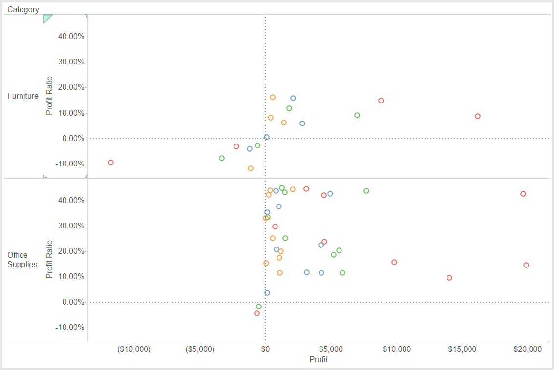
Desired look (after implementing the steps):
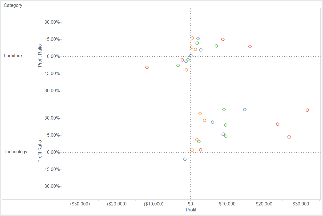
Default look (before implementing the steps):
First of all, what exactly does “centered” mean in this example? It means that we want the origin to be in the center of each chart. One way to achieve this is to make sure that the min/max values for each axis are equal to one another. If we can do that, then Tableau will take care of the rest automatically. The challenge becomes: How do we tell Tableau to do this? And can we make sure that each set of axes are equivalent (i.e. Furniture min/max values are consistent with Office Supplies min/max values)?
Step 1: Calculate the Min/Max of the Entire Chart
Our first task is to look across the entire visual and determine what the min/max values are for each axis. For any scatter plot or quadrant analysis, you are plotting two metrics against each other. So, we need to calculate the overall min/max for each metric while considering the scope of the entire window. See below for an example of one of these calculations:
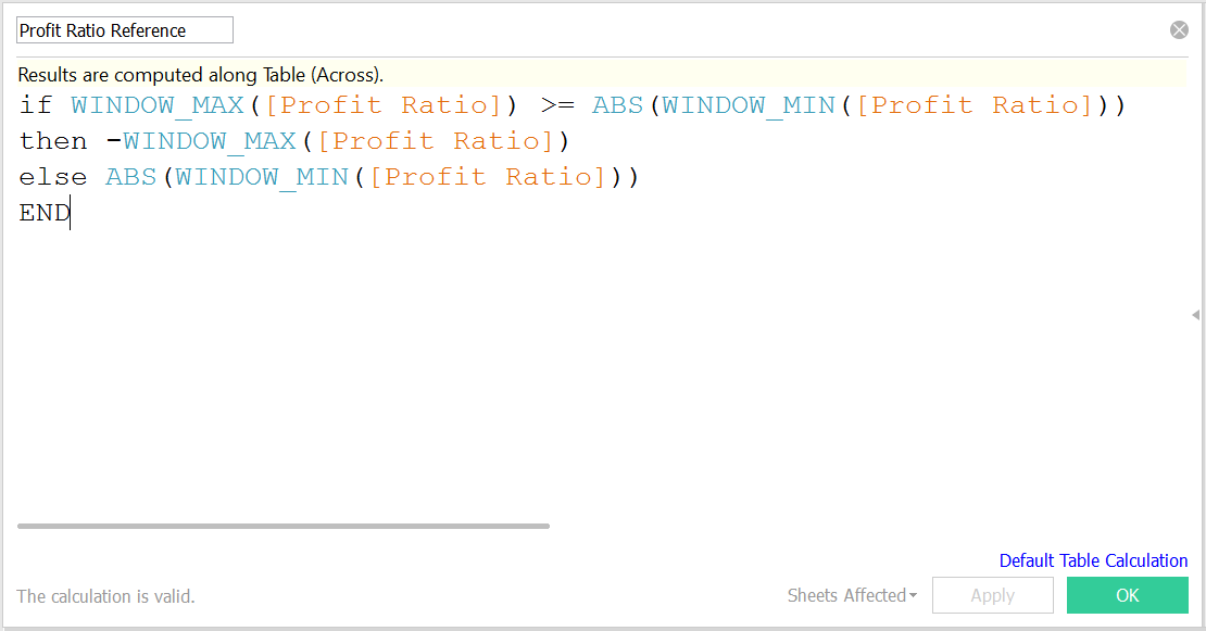
This formula tests the highest value on our chart according to the metric we supply. In this case, the metric provided is Profit Ratio. If the highest value is greater than the absolute value of the lowest value on the chart, then we want our chart’s minimum to mirror the value of the window maximum. Otherwise, we set our chart’s maximum to mirror the value of the window minimum.
Let’s translate that into plain English. If the minimum value is -10 and the maximum is 20, the new minimum should be -20. However, if the minimum is -10 and the maximum is 5, then the new maximum should be 10. With this setup, our center will always be zero.
You will need to perform this calculation for both metrics you are plotting in your chart. In this example, the two metrics are Profit and Profit Ratio, and we create two calculated fields named Profit Reference and Profit Ratio Reference.
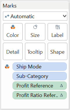
Step 2: Drag the Calculated Fields to the Marks Card
The marks card now holds your calculation. It should look something like the picture below. Note that the formula we just used is technically a table calculation due to the WINDOW_MAX and WINDOW_MIN functions.
Step 3: Edit the Scope of the Table Calculations
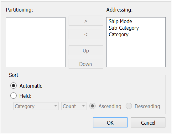
Now that the calculated fields are in the marks card, we can right-click on them and select Edit table calculation. In this case we will specify an Advanced scope where we dictate the dimensions table calculations used when partitioning and addressing the formula. The image below shows the settings that should be specified after selecting Advanced in the Compute using box. No dimensions should be left in the Partitioning box, unless you would like to partition your calculations in a specific manner.
After clicking OK, verify that your settings match those from the following image:
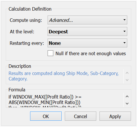
If your table calculation window matches this, you’re all set to click the OK button.
What you have just done is specified to Tableau that this table calculation will address all of the dimensions when executed, and that you will not be partitioning your view by any particular dimensions. Connecting the dots to the formula we wrote earlier, this means that you are comparing the overall WINDOW_MAX and WINDOW_MIN values across the scope of the entire chart for both your vertical and horizontal axis.
Step 4: Add in Reference Lines to Offset the Default Axis
The final step is to add each table calculation formula as a reference line for its respective axis. In this example, Profit Ratio Reference serves as the reference line for the Profit Ratio axis. Right-click on the appropriate numerical axis and select Add reference line. If your settings match the image below, you are good to go:
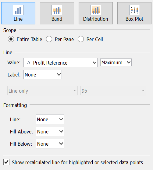
Feel free to add additional reference lines as desired in order to call attention to zero lines, averages or any other visual reference as you see fit. You now have your scatter plots or quadrant charts dynamically centered, regardless of any quick filters or interactivity!