Asking a magic eight ball the answer to questions we have about the future may not be the ideal way to get the right answers, but is predicting the future something that is even possible? Will I get a new car for Christmas? Will I finally get that promotion at work? Will I get the flu this year?
We’ll have to wait and see on the first two, but determining if the flu is in our future is something that we (Alex Lentz, Jimmy Steinmetz and myself) were interested in figuring out.
Gathering Data, Restructuring with R
In order to develop a prediction for risk of the flu, we utilized R scripts within Tableau to generate a logistic regression. If it’s been awhile since your last statistics class, a logistic regression is one type of modeling technique that can be used to predict binary outcomes (values between 0 and 1). This “yes” or “no” output makes logistic regression a great choice for predicting the flu.
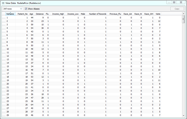
We gathered a data set of both binary and continuous variables for 347 patients.
The variable Flu is a flag for whether or not a person has a new strain of the flu. The rest of the variables pertain to the person’s income, race, age, distance from a hospital and number of annual visits to the doctor’s office.
Before building the logistic model in Tableau, the data was restructured using R. Since we are trying to predict the probability of having the flu (1=yes, 0=no), we needed to convert categorical variables (gender, race and income) into n-1 level binary variable so that we could utilize the R script functions inside of Tableau. This is why our data set now has Income (a 3-level field) split into two variables: Income_High and Income_Low. If both variables are 0, this indicates that income is medium.
Several logistic models were tested in R to determine the best method of prediction, and an ROC curve was generated to test exactly how good the models were at predicting flu.
What Is an ROC Curve?
An ROC curve visually plots the relationship between a true positive and a true negative. What does it mean to be true positive or true negative? This idea is easier to understand when we look at a classification table:
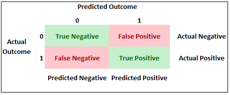
In our example, a true positive exists when our model predicts an individual to have the flu when they actually had the flu. A true negative occurs when our model predicts an individual does not have the flu when they did not have the flu.
The best model would be the one in which both the true positive and true negative were maximized. HOWEVER, although this sounds ideal, this is not always the case as the cost of both false positives and false negatives can vary within industry.
For our flu model, the ROC curve plotted every possible cutoff point as well as that point’s corresponding true positive and true negative percentages. We looked at the curve generated from our model compared to a 45-degree angle reference line referring to a completely random guess when predicting flu:
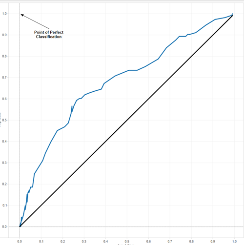
The top-left point annotated in the graph above represents perfect classification. The closer our curve gets to that upper-left point, the better our model. Although we are still far from perfection, we are much better than random guessing. Interactively clicking through the graph, a cutoff of 0.36 appears to be the closest point to the perfection point and was chosen to be our optimal point. There are more detailed methods for optimizing cutoff points, but our intention was to keep things simple.
Generating an Odds Ratio Table
In order to make interpretation of the chosen logistic model easier to understand, an odds ratio table was also generated. The purpose of an odds ratio table is to help understand the constant effect of a variable (i.e. Gender) on our predicted variable (Flu) in terms of relative risk.
An example of an odds ratio may be that for Gender, our result says 2.5. How would I interpret this result? We can say that males have 2.5 times the risk of getting the flu than females, with all other things being equal.
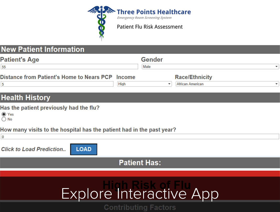
Building the Application Interface in Tableau
Once all the data cleaning and restructuring was completed, we were able to build out the application interface. In order to input a specific set of characteristics into the model, parameters were created for each of the independent variables.
We wanted the prediction to be calculated within Tableau to generate real-time results. Using the SCRIPT functions available, a calculated field was written to pass the parameter values to the logistic model and predict the probability of flu.
The process of writing R code within Tableau takes some practice, but a main component is to assign variables in Tableau (our parameter values) to .arg variables. Using this method, Tableau is able to communicate with R to generate a prediction. Below is a snapshot of the R code used:
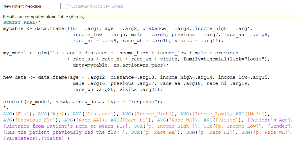
NOTE: As mentioned in Michael Treadwell’s “R Integration” post, it is important to remember that Tableau will treat any calculated field using the R functions in Tableau (SCRIPT_REAL, SCRIPT_BOOL, etc.) as a table calculation. That means that your calculations will not be performed on the underlying data. Tableau will assign each .arg# as an R vector according to the scope and direction of your table calculation.
The Final Product
The last step was to reference the odds ratio table mentioned earlier to display which factors contributed the most to the flu prediction. Changing the parameters may result in a different risk of the flu. So, with that, are you at risk to get the flu? Click below to find out yourself: