
I often see Tableau developers fall into the “Field of Dreams” fallacy. With the perfect formula or the bar chart just right, they’ll have the perfect dashboard that everyone will want to use. We’re tempted to think, “build it and they will come.” That’s not really the case.
The formula should be perfect, and the bar chart should be just right. These are necessary but insufficient conditions for the perfect dashboard. Tableau development is not about building the perfect tool – it is about providing a better way for users to create value through data. Users. Value. Data. Without your users, the system falls apart. The tragedy is that users are often considered last, if at all.

Above: Remember to put the users at the forefront.
Even with a revolutionary application like Tableau, the benefits to decision makers will only be realized if people are actually using the analysis and information provided to them. The value of the software and development time increase exponentially with user adoption. Every dashboard development plan needs an adoption strategy – a strategy to get people to want to use the new dashboard. This plan must include everyone from early adopters to the laggards.
InterWorks has seen it all, and our dashboard projects have run the gamut. Sometimes, it’s felt like we’re dragging users kicking and screaming into the New World. Other times, it’s been a struggle to scale and meet enthusiastic demand quickly enough (I prefer the latter). Below are some common strategies we use to advise our clients. The same basic strategy is true across all sizes of company, department or scale of rollout. These are important techniques to maximize your business value and differentiate the process from the dreaded Old (and unresponsive) BI.
Build Confidence through Transparent Data Validation
Show your math.
Building reports with Tableau – you’re the new gal/guy. Embrace it. Understand it. Part of being new is establishing street cred. Users need to trust your reports. For the vast majority of my clients, we’re not producing something completely new or unheard of. There are often established precedents for at least pieces of the work we’re publishing. Find them, find the users that produce them and help them understand that your Tableau work will line up.
Analysts are going to be your best friend here. They hate the Old Way. It’s slow and means they can never take Mondays off. They’re also likely to get grumped at for a typo at least once in a while. If you can convince those stakeholders that the New Way’s report is right, this is Step 1 in convincing their business units to use the new tool.
There’s a great and simple way to do this. In part of every dashboard system that you produce, forego the high tech and cutting edge visualizations. Forego mysterious dashboard actions. Build a crosstab – maybe one with a search box. Teach the analysts how to use this dashboard to double check your math (or self-serve Just-In-Time information). Build their confidence in your system by proving you’ve got it right.
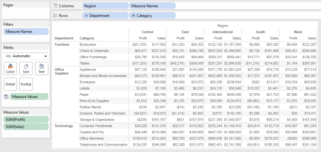
Above: A simple crosstab in Tableau.
Build confidence at the base of the adoption pyramid, and soon enough, the analysts will put their old excel reports away in favor of your new tool. They’ll even embrace the power of data visualization to tell the data’s story to users higher up the pyramid.
Extend Value through Self-Service
Share the love.
So, you have the right infrastructure and you’ve made the old reports obsolete with your expertise. Great. Now, remember the point: help the users create business value through improved use of data.
Remember those analysts I mentioned above? Help them do analysis, look good and continue to drive value. A great way to do this is by utilizing Tableau’s Data Server functionality (a default component of Tableau Server). Create Tableau Server hosted data sources from the data sources that already drive your award-winning dashboards. Create a template workbook and share that work with the analyst team. Then, teach them to self-serve from the great work you’ve already done. While this isn’t always possible given resource constraints, politics or any host of reasons, it can be a great way to maximize the value of your Tableau ecosystem.
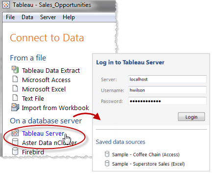
Above: Connecting to Tableau Server.
It’s also a good reminder that even the perfect dashboard probably can’t (or shouldn’t) answer every question. The perfect dashboard leads the user to every question and answers something like 80% of them. Any more than that, and you’ll find you’ve developed a tool that does everything mediocrely.
Define Your Data
A confused user is a frustrated user.
“Sales,” “Profit,” “Headcount.” You’ve been staring at these fields for weeks, dragging them onto sheet after sheet, moving the data through all the DB layers you thought possible. Now, you’ve built the perfect dashboard and it’s self-explanatory, right? Wrong. Make this mistake and risk alienating both the data stewards who have carefully built all those database views as well as the business team members who need to know what goes into all those pretty dashboards you’ve built. Fortunately, there is a very straightforward solution to this: Define the Data. Build a glossary. More accurately, build multiple glossaries.
The first should be a front-end glossary. Your audience here are your business users, and you’re defining terms. Make sure they understand what they’re looking at, and be comfortable explaining all the terms you’ve used. The best approach here is to interweave context into the primary dashboard itself (tooltips work well for this), as well as creating a separate screen that is purely devoted to defining the terms used.
Next, build a back-end data dictionary. This audience is more technical – probably analysts or IT. The goal here is to define the data in a more technical sense. Where does each field come from? What are the calculations used? This can (and should) manifest in several ways:
- Integrate definitions and comments into the Tableau data source’s metadata by commenting your fields. Potentially, this is being federated and used first hand (see point #2 above), but this is just probably protecting the legacy of the data source. Either way, transparency is key. I’m personally a big fan of automating this process by importing from an existing MDM system.
- Build a dashboard specifically focused on explaining the dataset. I often ‘cheat’ here and take advantage of our Workbook Tools for Tableau. This includes a feature we called Data Source Auditing, which analyzes a Tableau data source and provides a streamlined view into the back-end of how your data is connected and utilized. This tool automatically exports a dashboard with an explanation for every field in the dataset, including derivation, calculation, default aggregation and any comments that come along. Workbook Tools for Tableau isn’t the only way to do this, but it’s definitely the quickest. Regardless of how you achieve this, the important part is that you’ve provided complete transparency into the data source.
Proactively Communicate the Release Schedule
Everyone hates surprises.
So, the perfect dashboard just got a little more perfect, and you’re ready to release version 2.0? Great! Be careful not to let your eagerness to publish ruin someone else’s big presentation. Surprise your users with the quality, speed and transparency of your new Tableau system. Don’t surprise them by making unannounced changes. You’ll erode that confidence you’ve worked hard to build.
A few suggestions on how to do this:
- Update on a regular schedule. Users love fast and furious development, but you’ll need to balance that against the stability provided by moving to a regular release cadence rather than haphazardly creating an unpredictable environment.
- Forecast upcoming changes. Tell your users what is coming in the next release. Let them set expectations on their end based on your pro-active communication.
- Track historical changes. Keep a running log of what changed in what release. Like the glossary, this should be split into a front-end log targeted at business users and a back-end log targeted at your development team. The former is probably nothing more than a bulleted list of release notes; the latter is typically more complex. Again, I cheat by using Workbook Tools to create a diff statement for me, so I can easily justify and explain each change.
Focus on Presentation
Avoid the noise.
With your perfect dashboard in hand, you have some important decisions to make regarding presentation. This is where you get it to those users we care so much about. There are a range of options depending on your Tableau footprint. You may decide to create a system of hosting a .TWBX on a shared drive and distributing via Tableau Reader. This is an economical solution that commonly suffers from the attrition caused by the fairly high degree of effort necessary to access a report. A better solution that eliminates the mandatory software install and required manual workbook fetch is to use Tableau Server. I love the ease of Tableau Server. Users can access reports using nothing more than their web browser or iPad. The report is always up to date, thanks to the scheduling functionality.
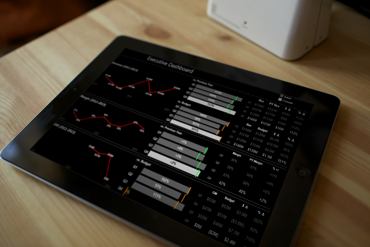
Above: A nice dashboard rendered on an iPad.
Tableau Server’s navigation and interface are very functional and are excellent technical tools for artifact management and access. When it comes to presentation, they lack the panache of a focused portal. A decade working in web development has spoiled me, and I often spoil my end users by developing an interface solely focused on report consumption. Utilizing a combination of HTML, Drupal and Tableau’s Javascript API, we’ve had immense success integrating embedded Tableau visualizations into customized portals that look and feel like a specific web tool.
In many cases, I find this to be the single best way to present Tableau content to business users. I control all aspects of the experience and can seamlessly blend Tableau content with non-Tableau content. Maybe you have a complementary BI platform and want to use that for the drill-downs? Additionally, I can create cross-workbook global filters and parameters, set contextual framing for complicated visualizations, integrate social media interaction and track usage more tightly. When executed correctly, end users may have no idea that I’m using Tableau. Instead, they just believe that we’ve built a very tightly integrated product that has many capabilities, including cutting-edge visualization.
To Be Continued …
It took some time to get through the first five ways to drive end-user adoption of Tableau, which is why I’m splitting this blog post into two parts. There’s a lot that needs to be said, and I want to give you the chance to digest everything we’ve covered so far before moving on.
Once you’ve processed all of this, check out the remaining five points in “10 Ways to Drive End-User Adoption of Tableau – Part 2.”