
Tableau Deep Dives are a loose collection of mini-series designed to give you an in-depth look into various features of Tableau Software.
We’re spending the latest Deep Dive on dashboard design. In Part One, I spent a lot of time talking about dashboard theory. Specifically, we talked about planning the dashboard using the three C’s: Context, Consistency and Customer. These three words ask specific questions on the who, what, where, when, why and how that help frame what we are trying to accomplish with our reporting tool.
In Part Two of this Deep Dive, we’re going to plan out our visualizations and then construct the dashboard layout, first on paper and then inside of Tableau Desktop. Let’s start by talking about the theory of layout and structure.
Concepts
What Do We Look At?
There are a lot of ways to approach the topic of structure and layout for your dashboard. My professional background is online marketing and there is a lot of data that has been accumulated about where website visitors look. Your dashboard is probably most analogous to an online tool. Eye tracking studies provide a lot of insight into how the Internet has trained online visitors to use web pages and where to look.
We’ll discuss some of the main subjects these eye tracking studies illuminate:
WEIGHT: In a visual hierarchy, different elements have different weights. Think of your dashboard objects as planetary bodies and their gravity is what attracts your eyes. Something with a lot of gravity or weight draws a lot of your attention. The elements on your dashboard you want to have the most emphasis on should have the most weight. Creating this concept is a combination of structure, style and design. Structurally speaking, more visual types of charts are going to have more weight.
HOT SPOTS: The most visually accessed areas of a web page are the top left-hand corner (#1) and the top right-hand corner (#2). These are traditionally where the main logo of the page is located and the navigational call to action, like a contact us page. I recommend you follow these same trends by putting your dashboard title in the top left-hand corner and your filters and parameters in the top right-hand corner. This leverages the eye training the Internet has already developed in our user.
LEFT MARGIN: As a result of English being read left to right, our brains naturally place more emphasis on the left-hand side of the page. This tendency has transferred over to non-English speaking cultures as well with the Internet explosion being largely pushed by English-speaking countries. In dashboard structure and layout, put your emphasis on the most important objects to the left and then working your way right and then down.
FOLD: The fold is any part of the tool that appears below the visible part of the screen when the dashboard is loaded. In the old days of web marketing, anything below the fold was thought to be invisible and lost. Nowadays that’s not as true. Human beings are far more likely to scroll down for even just a quick scan. That’s great for dashboard designers, because that gives us more vertical real estate. This is especially important when optimizing your dashboard for use on mobile devices.
There are far more things to consider on this topic, but these considerations give us a great starting point.
Layout Techniques
Within Tableau, there are several options regarding how we build our dashboard: size, tiled, floating and containers.
SIZE: There are three different options when sizing your dashboard and those are fixed, range and automatic. My very strong suggestion is to fix the size of your dashboard every single time. This is for two reasons. The first is that any floating objects should be repositioned by relative x and y-coordinates to the new size of the dashboard. This can mean that floating objects can end up on top of your visualizations or obscuring other elements. The second reason is that automatic sizing can impact performance, as per our Tableau Performance Checklist.
TILED VS. FLOATING: Tiled dashboards are like pieces of a puzzle that are fit together. If you resize one piece, then the other pieces automatically resize to accommodate that change. Floating objects are like playing cards that are laid out on a tabletop. They can be side by side or even on top of each other. You can even do a combination of tiled and floating. For instance, you can position floating layout containers wherever you want on your dashboards, but you can also have tiled dashboard objects inside of the container.
There are no hard or fast rules on which approach is best. In my opinion, it depends on how complex of a layout you’re designing. Simple dashboards are fine with tiled layouts, more complex layouts can use floating containers and finally, the most complex layouts are easiest to manage with all floating objects.
CONTAINERS: Containers are simply dashboard objects that are designed to contain other objects. They are either horizontal containers or vertical ones. They allow us to do two main things with additional specific uses as you get more technical. First, they allow you to reserve space on your dashboard. Secondly, dashboards allow tables to expand or retract the space they use on the dashboard, up and down for vertical dashboards or left to right for horizontal dashboards.
Enough theory for this article. It’s time to start applying it all.
Practicum
The Views
It’s very important to plan your visualizations as a part of the overall dashboard design process. If you create each worksheet in a silo, you could end up with seven bar charts. That’s confusing for the eye when stacked onto a single dashboard. To help attract and guide the eye of the report consumer, I’m going to intentionally create more visually interactive charts in conjunction with very simple charts that produce only a single number, a total. That’s how I’m managing the dashboard’s weight.
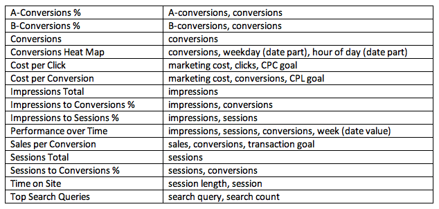
Pre-planning what fields you’ll need for your worksheets is especially important if you’re going to use Google Analytics as a data source as we would with our hypothetical SEM dashboard. You have to select which fields you want to access and then create an extract, or export as a flat file. Here are my views with the necessary fields:
Also, I’ve got to consider my global filters that I want to include: campaign type, country and campaign year (date part). To make my views more dynamic, I’m going to have a couple of parameters. The first parameter will allow me to switch from actual percentages to a variance compared to my metric goals for my most important KPIs (cost per click, cost per conversion and sales per conversion). The second parameter will allow my user to toggle what measure they want to see for the weekly performance: impressions, sessions or conversions.
Adding Emphasis
Let’s now figure out which of these views are the most important and which ones are best suited to a highly visual format. I’ve already identified my three most important KPIs (CPC, CPL, and avg sales). From a visual standpoint, I’d love to physically show a conversion funnel from impressions all the way down to converted transactions.
We marketing people love that funnel. It would be a highly compelling visual object that would pull the eye to the most important metrics.
The other table that I really want to make compelling is my conversion times, by weekday and time of day. That gives me a strong indication of when I should be spending most of my paid search budget. If visitors are converting at the highest rate on business days between 12PM and 2PM, that’s exactly where I’d like to concentrate my budget for the best return. I think a highlight table would make an excellent choice there.
Time to start building!
Structure
Once we’ve prepared our data and built our views, it’s time to plan where all of this stuff is going to fit onto my dashboard. I recommend sketching out your idea on a piece of paper. Don’t worry if it’s not perfect. You can always revise as you go, but at least you’ve got a blue print to start from. Here’s my initial sketch:

I’m focusing on the layout and placement of my worksheets. The conversion funnel is going to be the center piece of the view while my key metrics are across the table at the very top.
What’s Next?
I’ve got all of the prep work out of the way. I’m now ready to build my dashboard. In Part Three of this Dashboard Deep Dive, we’ll build a proof of concept and talk about the technical aspects of dashboard layout. Until then, any comments in the space below are appreciated.