Questions from Tableau Training: Dynamic Label Positioning

Data

Questions from Tableau Training: Dynamic Label Positioning

Our Certified Tableau Trainers are asked a myriad of questions each day. In this series, they share some answers.

From a Desktop II Intermediate class in Melbourne, Priyanka asked me the following question:

“In my chart, I want to show forecast and actual as a bullet graph. I’d like to label both values at the end of the chart, whether that’s the bar that’s exceeded goal or just bullet if the goal hasn’t been reached yet.”

This was an interesting question that I thought would benefit others to see a solution to. Let’s dig in!

Bullet Chart

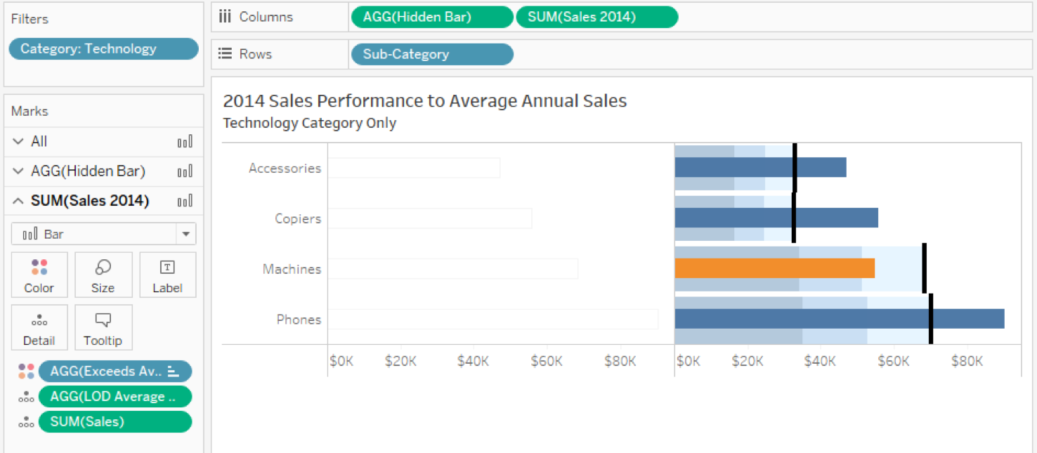
We are using our Sample Superstore data to get the following view:

Questions from Tableau Training Dynamic Label Positioning

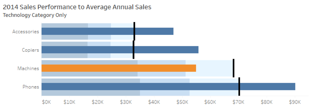
Bullet Graph Comparing 2014 Sales to Average Annual Sales

The key elements to a bullet graph are using the second measure, the goal, in two reference lines. Remember to put this measure on the detail button, so we can use it in our reference lines. The first is a reference line per cell as the bullet, a thick black line to serve as the finish line for the goal. The second is a distribution band with an indication of progress towards the bullet. I’ve set up my distributions as percentages: 50, 75 and 100 with a fill below gradient.

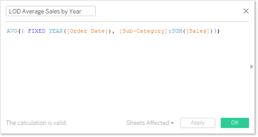
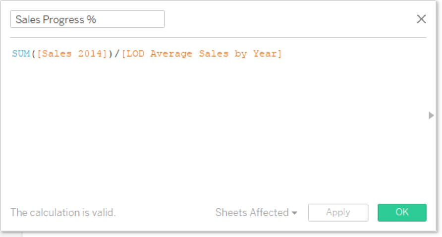
As a fun side note, I’m constantly telling my students that Level of Detail calculations pop up all over the place. The chart above is another example. I’ve calculated my goal measure as the average annual sales by sub-category using a fixed LOD, like so:

Questions from Tableau Training Dynamic Label Positioning

And here’s the calculation for our condition formatting:

Questions from Tableau Training Dynamic Label Positioning

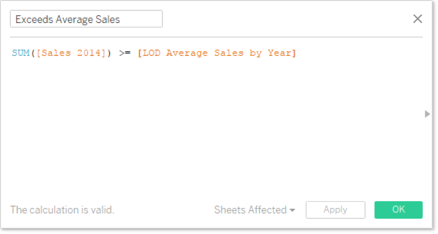
Note, the LOD field is already aggregated inside of its calculation with AVG(). Now that we’ve got this starting block, let’s add a label to the end of each bar that includes both the actual sales, the average annual sales and the percentage progress.

Hidden Dual Axis

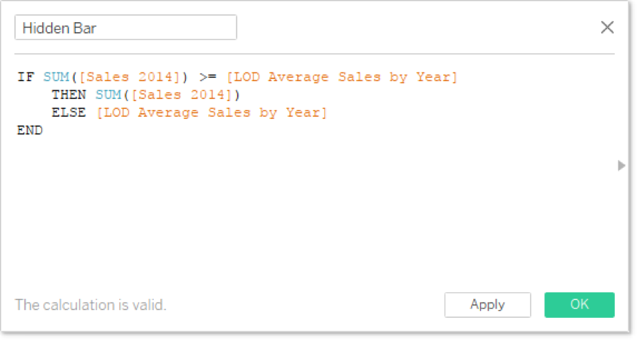
The way we are going to position are labels at the end of the bars, is to use a dual axis with a hidden bar. Remember, our goal is to put our labels at the far right of our chart, either next to the bar or to the bullet. I need to create a calculated field that will detect the larger measure, either Sales 2014 or the Average Sales by Year.

Questions from Tableau Training Dynamic Label Positioning

I’m going to use this to create a dual axis. I prefer to bring my second measure onto Columns, fix up my formatting on my marks cards and then combine into a dual axis after everything is perfect. Here are my steps:

  1. Hardcode my mark type from Automatic to Bar on the All marks card
  2. Hide the axis title on the Hidden Bar axis
  3. Format the Hidden Bar axis to custom currency (no decimals, Ks)
  4. Set the opacity of the Hidden Bar marks to 0%.

To show the hidden bar, I’ll add a very light border just so you can see it in the image. Remember, I want my hidden bars to be on the bottom of my dual axis, so I’ll add it to the left of Sales 2014.

Questions from Tableau Training Dynamic Label Positioning

Preparing Formatting Before Creating a Dual Axis Chart.

To create a dual axis, I’ll right click on my Hidden Bar field and select Dual Axis. Synchronize the axes and then hide the top axis that belongs to Sales 2014, so we’re only seeing a single axis at the bottom (the Hidden Bar axis). You can hide an axis by right clicking on the axis and unselecting Show Header.

Questions from Tableau Training Dynamic Label Positioning

Dual Axis with Hidden Second Axis

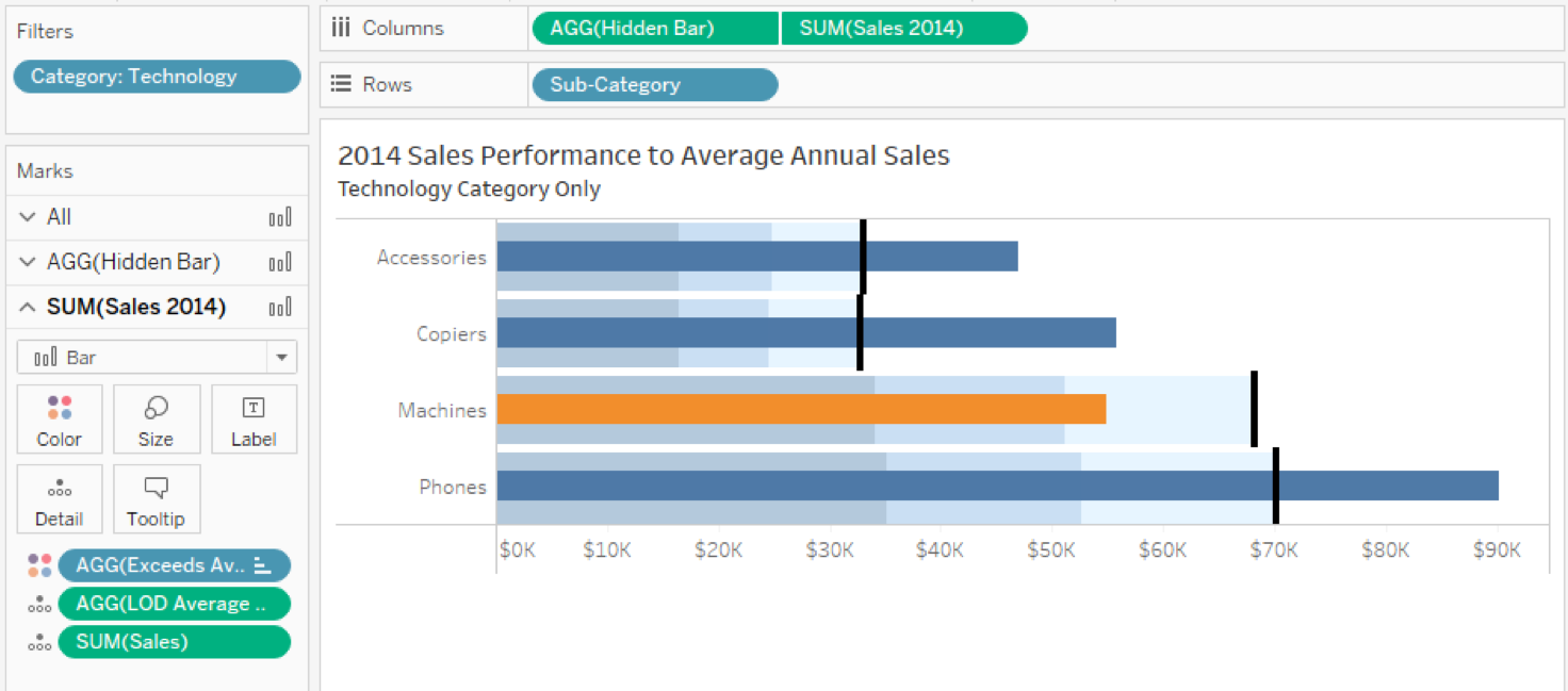
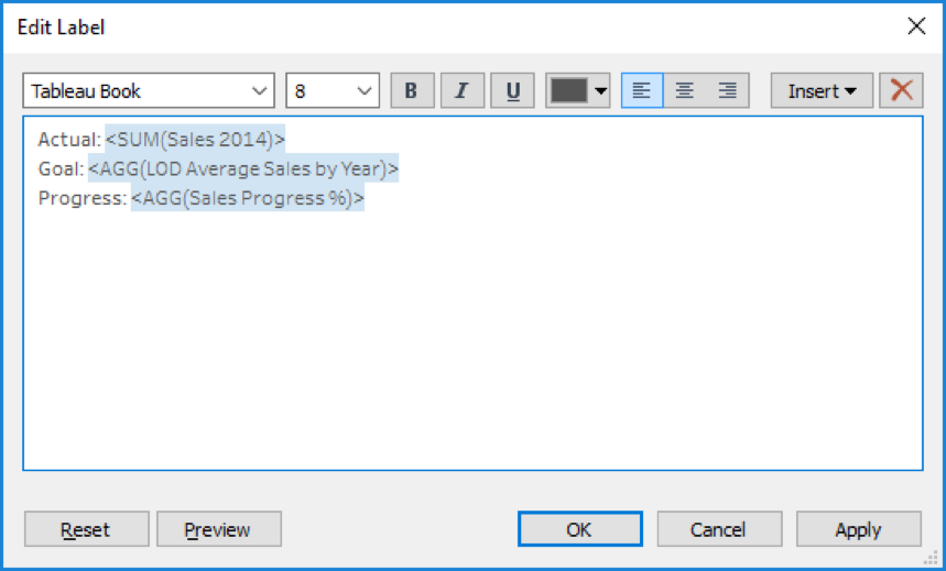
Looking at the chart above, you cannot tell that there are hidden bars beneath our Sales 2014 Measure. Now, it’s time to set up our labels on the Hidden Bar chart. I need to create another calculation for our percent of progress.

Questions from Tableau Training Dynamic Label Positioning

Drag the appropriate fields onto the Label button on the Hidden Bar marks card and then edit the label. Note, I put a few blank spaces before each line to space it away from the end of the bar when we look at it on the viz.

Questions from Tableau Training Dynamic Label Positioning

The final step is to turn off the tooltips using the All marks card. Here’s the final view:

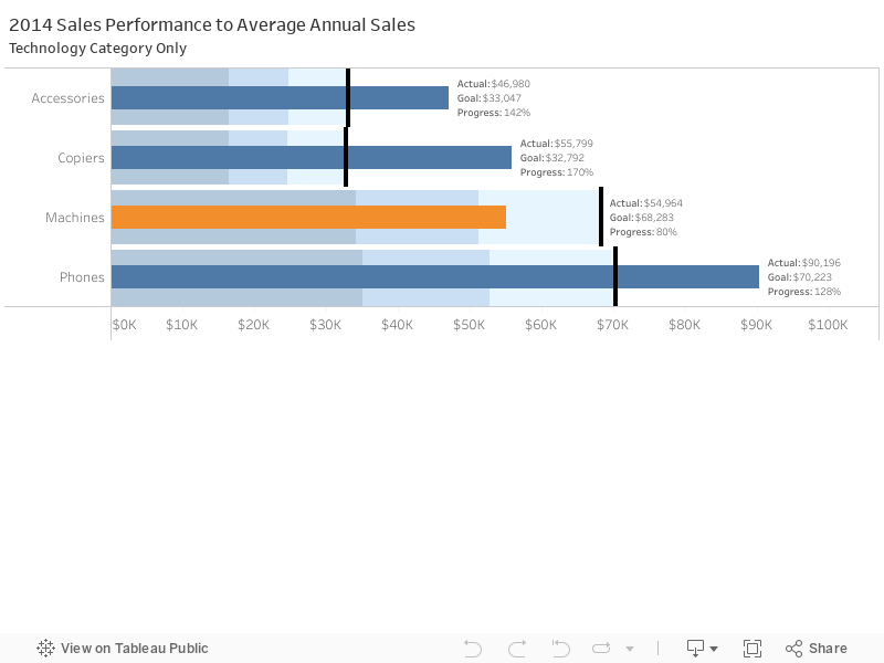
I confess that it’s a bit busy. That’s why I made my bars so big and filtered down to a single category to keep it from being overwhelming. Regardless, it does solve the requirements as set forth for the visualization and that means mission accomplished!

Thanks, Priyanka!

Want More Questions from Tableau Training

  1. Questions from Tableau Training: Quick Filter Interaction
  2. Questions from Tableau Training: Labeling with Table Calculations
  3. Questions from Tableau Training: Speeding Up Presentation Views when Using Tableau
  4. Questions from Tableau Training: Dashboard Actions
  5. Questions from Tableau Training: Business Day Calculations
  6. Questions from Tableau Training: Adding Gaps Between Bars
  7. Questions from Tableau Training: When to Pivot Data in Tableau
  8. Questions from Tableau Training: Adding Conditional Formatting
  9. Questions from Tableau Training: Setting Weekday Start
  10. Questions from Tableau Training: How Do ZIP Codes Work in Tableau?
  11. Questions from Tableau Training: The Small Grey Bar Within a Quick Filter
  12. Questions from Tableau Training: Matching Mark Color
  13. Questions from Tableau Training: Showing the Null Indicator
  14. Questions from Tableau Training: Can I Manually Set the Colors of a Stepped Gradient?
  15. Questions from Tableau Training: How Can I Get Box Plot Data into a Crosstab?
  16. Questions from Tableau Training: How Do I Clear a Worksheet? Make a Copy?
  17. Questions from Tableau Training: Opening URL Actions Inside of a Dashboard
  18. Questions from Tableau Training: Can I Move Mark Labels?
  19. Questions from Tableau Training: How Can I Use My Current Report to Create a Viz?
  20. Questions from Tableau Training: Can I Create Text Hyperlinks on a Dashboard?
  21. Questions from Tableau Training: How Can I Transform My Crosstab into a Flat List?
  22. Questions from Tableau Training: Labeling the Top N
  23. Questions from Tableau Training: How Can I Customize Charts with Parameters?
  24. Questions from Tableau Training: Combining Measures into a Single Line
  25. Questions from Tableau Training: How Can I Create Custom Color Palettes?
  26. Questions from Tableau Training: Can a Top N Parameter be Nested Within Other Fields?
  27. Questions from Tableau Training: Conditional Scope on Tableau Calculations
  28. Questions from Tableau Training: Top Ten Plus N
  29. Questions from Tableau Training: Dynamic Label Positioning
  30. Questions from Tableau Training: Using Cross Joins to Solve Active Tickets
  31. Questions from Tableau Training: Top N Highlight Table
  32. Questions from Tableau Training: How to Use Specific Dimensions in Table Calculations
  33. Questions from Tableau Training: Moving Reference Line Labels
  34. Questions from Training: Comparing Metrics for Same Weekday in Previous Year
  35. Questions from Tableau Training: Colouring Specific Columns and Rows in a Crosstab
  36. Questions from Tableau Training: Creating a Custom Legend as a Sheet
  37. Questions from Tableau Training: How Can I Draw a 45-Degree Angle?
  38. Questions from Tableau Training: Down the Aggregation Rabbit Hole
  39. Questions from Tableau Training: Percent Change from Previous Period on a Map
  40. Questions from Tableau Training: Union File Names as Years
  41. Questions from Tableau Training: Conditional Coloring on Sparklines
  42. Questions from Tableau Training: Moving Column Headers to the Top of the View
  43. Questions from Tableau Training: Isolating Rank with Parameters and Calculations

More About the Author

Robert Curtis

Managing Director, APAC
Kickstarting Data Innovation in Healthcare On 13 March 2024, InterWorks was a proud Platinum sponsor of the first ever Data & Analytics in Healthcare conference, hosted by ...
Building Solutions with InterWorks at Corinium’s Data Architecture Conference in Melbourne InterWorks was a proud sponsor of the Data Architecture Conference hosted by Corinium in Melbourne on 21 and 22 June 2023. Hundreds of ...

See more from this author →

InterWorks uses cookies to allow us to better understand how the site is used. By continuing to use this site, you consent to this policy. Review Policy OK

×

Interworks GmbH
Ratinger Straße 9
40213 Düsseldorf
Germany
Geschäftsführer: Mel Stephenson

Kontaktaufnahme: markus@interworks.eu
Telefon: +49 (0)211 5408 5301

Amtsgericht Düsseldorf HRB 79752
UstldNr: DE 313 353 072

×

Love our blog? You should see our emails. Sign up for our newsletter!