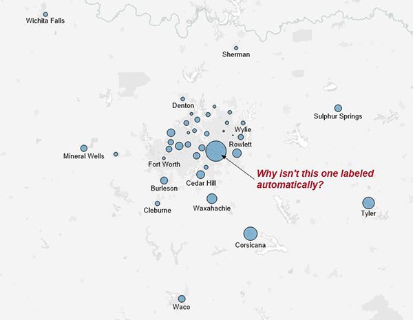
Tableau is great at mapping, but sometimes labels don’t show up where you want them. Labels on marks that are too close to each other are hidden by default to prevent overlapping text. That’s a good thing. When you have several in a small area though, it’s important to show the one with the highest value. That doesn’t happen by default in Tableau, so users must find another way. This post explains why straightforward solutions are inadequate and describes a method to overcome those shortfalls.
Likely Solutions
The simplest way to ensure the marks with the highest values take precedence is to set the label options to “Min/Max” based on a selected measure. This approach isn’t the best because now the map only has one or two labels which may even overlap (depending on user selection). Calculated fields can expand this based on Top N or Rank tests, but that still leaves the map with many hidden or overlapping labels. We may also try using the “Text” mark type for labels, but then there’s no way to prevent overlaps.
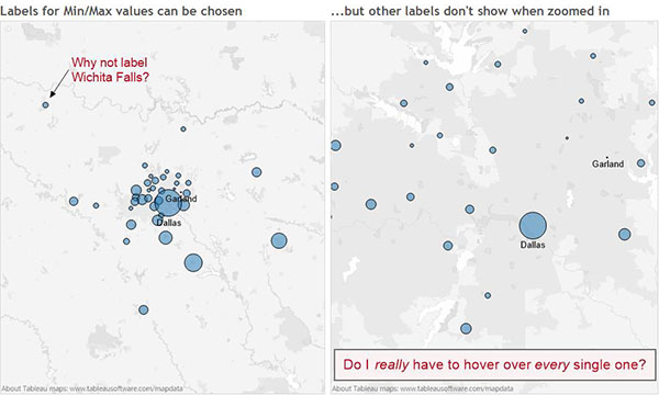
At this point, we might give up and say that the labels exist in the tooltip if a viewer really wants to know that information. Should we expect busy managers or executives to hover over each mark? What if you’re sending a static image through an e-mail distribution? Don’t give up yet – there is another way!
Using a Filled Map for Smarter Labels
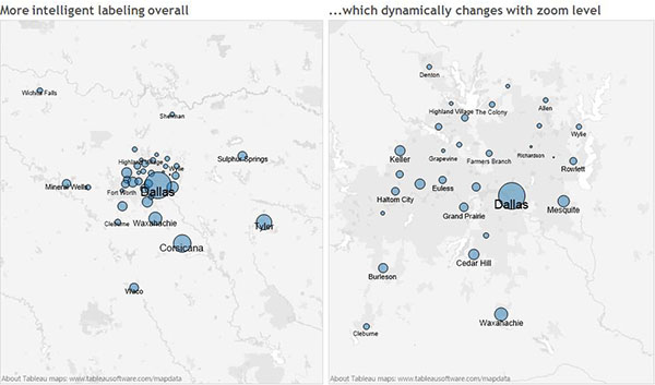
Wouldn’t it be great if Tableau could label the largest marks, hide text that would overlap and show all the others that won’t overlap? Oddly enough, Tableau can do this on a filled map but not a point map. A dual axis map will allow the smarter filled map labels to sit above your point map. It will also change according to zoom level. The result and steps on how to make it are below.
How to Make the Magic Happen
For this to work, the source data must include values for latitude and longitude rather than letting Tableau generate the coordinates automatically. When using discrete coordinates, a filled map looks exactly like a point map. Yet, the labels function very differently.
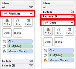
To get started, make sure Latitude and Longitude are set as dimensions instead of measures. Then, drag both into the window and add the place names (“City” in this example) onto the label shelf. Next, select “Filled Map” from “Show Me” or use the drop-down on the marks card. When we drag a measure (i.e. Sales) on the size shelf, the points remain the same size but the text changes. This is an important step. Without it, the words on larger measures would still be hidden.
Once you have the text, make a second axis with circle size based on Sales (or some other measure). Simply add a second Latitude dimension onto the rows shelf, right-click and select “dual axis.” This allows you to set the mark type individually for each layer of the map. Select “Latitude (2)” and change the mark type to “Circle” as shown below.
Final Tweaks
The above steps will do some things to your map that aren’t desirable. Here’s a checklist of what you may need to clean up:
- Since we’re dealing with close or overlapping marks, it’s a good idea to dial down the transparency and add a border to set them apart (on the “circle” layer).
- Set the transparency to zero percent on the filled map layer to hide the circles.
- Turn off “Show Mark Labels” on the layer with “circle” as the mark type to avoid duplication.
- If you don’t want labels to be centered on the mark, edit the label text to add a blank line above or below.
- Experiment with the text and mark sizes to find the best fit for your data.
The attached workbook should help you dive in to see more of what’s going on in the above solution. Happy mapping!
The Latest
-

Fabric Governance: Content Certification and Deployment
17 April, 2024 -

Fabric Governance: Content Organization and Subdivision
17 April, 2024 -

Fabric Governance: Users, Licenses, Roles and Capabilities
17 April, 2024