
Typical day-to-day analysis is focused on things that have happened in recent days, months or years. We seldom go far enough into the past to make us think about what to do with dates prior to “date zero” (normally, January 1, 1900). That is unless you’re a paleontologist, history teacher or anyone else who may care about what happened in the world more than a century ago. If you want to visualize a timeline and handle events as far back as ancient history, this post is for you.
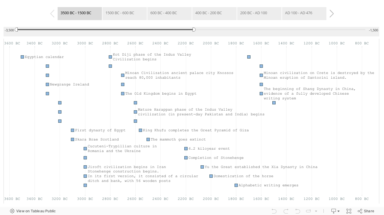
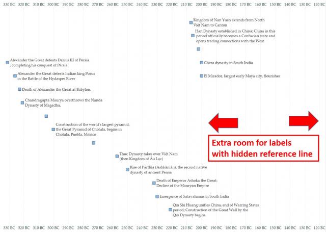
Below is a visualization of ancient history that we will use as an example. Click on the image to interact:
Handling Dates Prior to 1/1/1900
Even though the calculation: Date(0) returns 1/1/1900, it’s possible to input a date prior to that using negative numbers, which represent the number of days prior to date zero. Using that method, January 1, 0400 is the first day that Tableau can correctly recognize as a date. Check Date(-547863) vs. Date(-547864). Going back further requires a different method.
On a long timeline, the year is the only part of a date that’s necessary. By converting the input data such that positive years are AD and negative years are BC, we can easily plot points in time like any other measure.
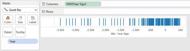
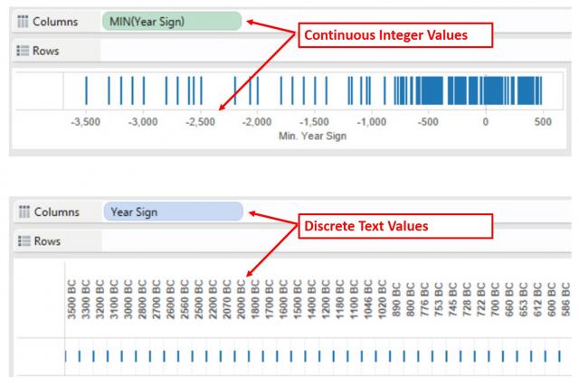
The problem now is making sure the axis labels look like a date and not just a number. Our first inclination may be to convert it into properly formatted text using a calculated field, but this won’t work for a timeline. Using text will cause our axis to become discrete, which erases any gaps in time. To ensure the axis keeps appropriate space between years which have no data, a continuous axis is the only option.
Formatting the Dates
Custom number formatting can turn the numerical values on the axis into labels a viewer would recognize as points in time. Here are a two ways to specify custom formats:
-
Right-click the field in the data window, then choose Default Properties -> Number Format… -> Custom.
-
Right-click the axis and choose Format… Then, under the Numbers menu, choose Custom.
Here, you can specify how to format positive numbers, negative numbers and zeros. Tableau recognizes the same types of inputs as Microsoft Excel, described in detail here. Microsoft also provides the graphical reference below:

In our timeline example, the custom format definition looks like this:
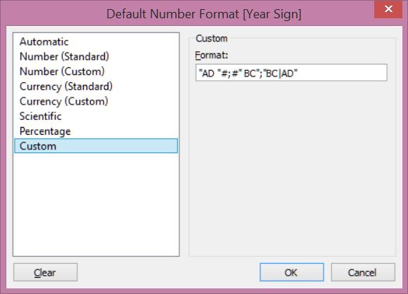
The first part of the comma-separated list puts AD in front of positive numbers; the second puts BC behind negative numbers. The final code, “BC|AD”, hides 0 on the axis since our calendar jumps straight from 1 BC to AD 1.
Assigning Rows to the Layout
To show labels and make them readable, we need to assign a row to each point. One way is to add a row number in the data source. The downside is that it makes it difficult to change your mind about how many rows you want in view. We can also assign rows using a table calculation that looks like this:
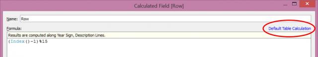
This has two parts: an index function that increments for each value as you specify and a modulo operator. Index() is a table calculation which requires us to specify the scope and direction. To do that, choose Default Table Calculation as shown. Under Compute Using…, choose Advanced. Here we’ll tell Tableau to use the year and the description to count up values:
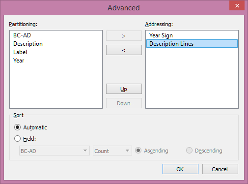
The modulo operator (% sign) takes this index value and restarts the numbering every 15 values. Replace the 15 in the formula above with another value (or a parameter) to easily modify the number of rows in view. Since the modulo operator returns 0 for the first row in the set but Index() starts at 1, we subtract 1 from the index value so the first point is aligned with the top row.
Labeling Points
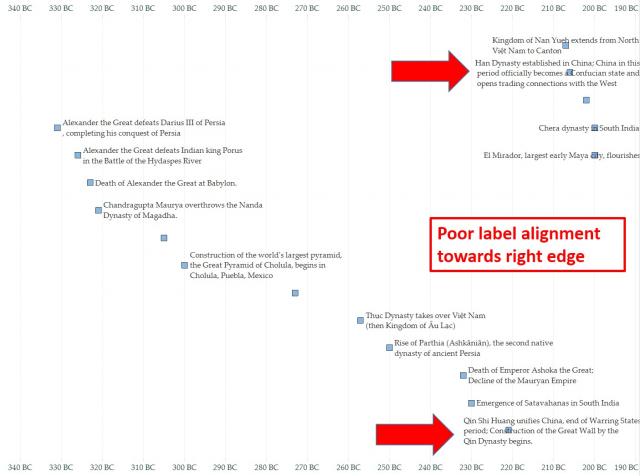
Now that everything is laid out in rows, we find another problem: When placing labels on the right of the marks, those on the right side of the view are poorly aligned.
To add space on the right, create a calculated field as shown below:
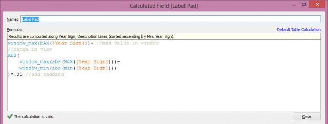
Follow the same steps as the row calculation above to define the scope and direction for the table calculation. Then, add this field to the Detail shelf. Finally, right-click the axis to add a reference line and specify the options shown below:
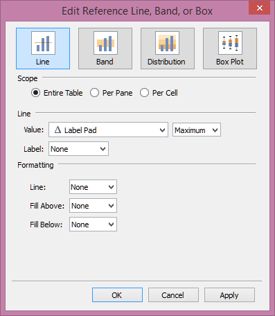
This invisible reference line forces the axis to go beyond the maximum point in time, allowing enough room for the labels:
Finishing Touches
The example workbook includes several additional features to add polish to user interactions that are beyond the scope of this post, such as:
- Using Alt+Enter in the underlying Excel file to control text wrapping.
- A dual axis allowing most labels to show automatically and hidden labels to become visible when hovering over a point.
- Custom tooltips to show source attribution and hide the toolbar.
- Using Tableau Story Points to group time periods into segments that are easy to read and navigate.
Download the workbook to experiment with your own data and have fun exploring ancient history!