
Sam used to live in Excel for financial analysis, that is until he discovered Tableau. In this series, he shares how Tableau can be a massive difference-maker for financial teams.
I’m a chartered accountant, and my background is in building finance functions and creating financial performance analysis reporting functions. I trained in a public practice, and after around six years, moved into industry. I’ve been working in industry for the last seven years, and analysing and reporting financial performance remains core to my role. It’s the way I add value.
It can seem daunting facing the decision to adopt a business intelligence (BI) tool. Whether you have an existing tool or this is your first step towards adopting a BI tool, it may feel like standing on the edge of a precipice. I’m going to take you through how I use a BI tool and see if I can show just how useful such a tool is as well as how easy they are to implement and use day to day.
There are many BI tools in the marketplace, but the reasons for use are quite often very similar. People want to be able to analyse, gain insight and make better decisions. Whichever tool you choose, you are not making the wrong decision. Just by embarking on your journey toward using a BI tool, you are taking a step closer to the way the business world will be digesting data, creating business intelligence and carrying out data analytics for many years to come.
Your first choice may not be the tool you eventually end up with. Be prepared to test different products, but if possible, take a low risk / low cost approach to start. Tableau offers a free trial, so there’s a good starting point.
My Experience with Tableau
I head up Operations and Finance for InterWorks Europe, a consulting practice and Tableau Gold Partner. InterWorks specialise in Tableau Software, which has topped the Gartner Magic Quadrant for the previous six years and is considered by us to be the best in the market. If you decide after reading this blog you would like to try Tableau, again, there is a free trial.
There are a few main ways I separate out my use of Tableau. This not only helps me to keep my focus on the purpose of each dashboard or visualisation I build, it also helps me to think about what I want the output to be, how the output will be digested and who will be digesting it.
In case visualisations and dashboards are new terms to you, please check out my previous blogs in this series for a detailed explanation. In brief, a visualisation is a visual representation of data and a dashboard is a collection of one or more visualisations in one place. I am hesitant to use the word “graphical” when describing a visualisation as it may imply use of charts, but a visualisation could be a table formatted in a way that makes the data pop out. That said, an easy way to picture a visualisation is to imagine a line chart tracking daily sales over time, which is a basic visualisation, and a column chart (also known as a bar chart) showing monthly sales, another visualisation. See Figure 1 below:
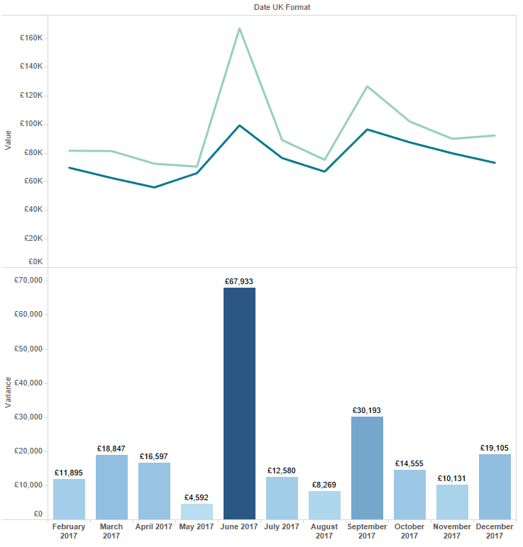
Figure 1: A line chart and a column chart.
Key Uses of Tableau as a BI Tool
Compliance / Monitoring / Reconciliation (CMR)
It’s worth starting with this, not because it’s the most glamorous part of using Tableau, but because it’s one of my most common uses and one that isn’t often promoted. In fact, I use Tableau for compliance and reconciliation just as much as I use it for the more glamorous and talked-about analytics and insights.
CMR is something finance teams do periodically at varying cadences (e.g. daily, weekly, monthly, quarterly, yearly). Before being able to carry out CMR, there’s normally a number of time-consuming tasks often made up of some lengthy workflows that are manual, low value and prone to human error.
The outcome is much higher value, e.g. you find something that shouldn’t be there or you confirm everything is compliant, so it is the outcome we want to spend more time on. With Tableau, I aim to convert all the manual time spent building reports into time on the high value analytical or insight work.
Let’s look at example of how we apply Tableau in practice. Working in a consulting business, there are two key areas which need regular monitoring; timesheets and expenses. We expect a high level of compliance in both areas; staff need to submit both elements on time so we can optimise the invoice process.
We use Tableau to do the leg work by building dashboards that show consultant timesheets, the number of hours worked and any non-compliant entries highlighted to stand out. The data source is a live connection to our CRM data and the reports are automatically delivered to the team manager’s inbox each morning. They can quickly see who is not compliant, and within a few minutes, email out to team members who need a nudge.
The dashboard requires very little maintenance, keeps time spent on compliance to a minimum and has improved timesheet compliance. We use a dashboard similar to that in Figure 2 below to monitor timesheet compliance, i.e. have timesheets been submitted each week and do they account for the 40-hour working week? The aim is not to show you visualisation best practice but how the CMR function can be automated. The non-compliant timecards should pop out within a couple of seconds.
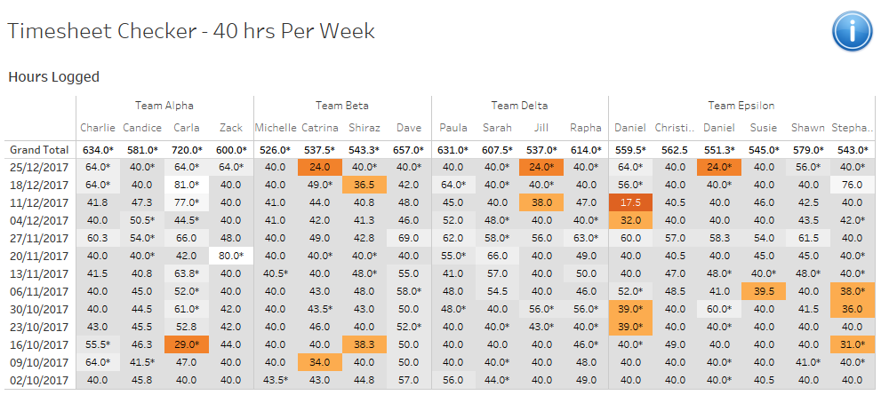
Figure 2: A timesheet compliance dashboard.
The other area I mentioned was expenses. We have a large volume of transactions flowing through our corporate cards. As we scale our headcount, the volume of transactions increases. We use Tableau because we know it will scale with us. By using Tableau, we reduced the time spent on monthly reconciliation process by around 50%, if not more.
In Figure 3, you can see an example of a comparison of credit card statement balance vs. the expense system. Green light indicates no difference and red light indicates that there is a difference we need to investigate. With Tableau, we are able to deep dive into the line-by-line detail.
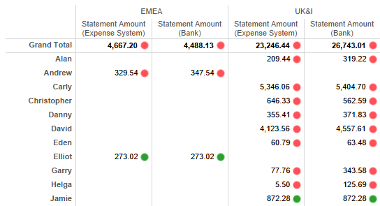
Figure 3: Credit card balance vs. expense system.
We can quickly see the difference by hovering over the red light in Figure 4. Sometimes the difference is obvious, sometimes it is not. But the main point is that we have automated a large chunk of the preparation work; we have fast tracked ourselves to the outcome with increased accuracy, so most of our time is spend tidying and making sure there are all green lights.
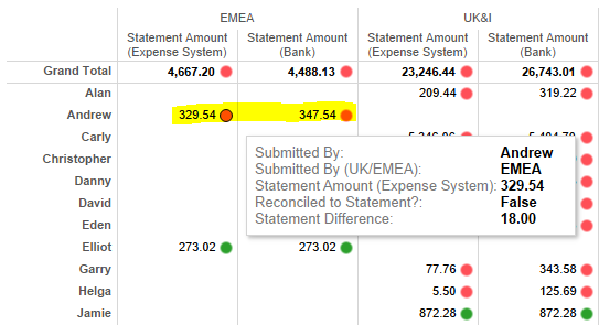
Figure 4: Hovering over the red light presents a tooltip with more info.
If we want to look back at a previous month, we can change the date filter. No need to open last month’s Excel report and worry about fitting in the task of updating the data because it might have changed.
Compliance work is necessary work, sometimes thankless and very rarely glamorous, so it often goes unnoticed by most outside of the finance team. But, it doesn’t need to be arduous and can be made easier. With Tableau, it can be swift, accurate and lightweight.
Analytics / Insight
This is another area where Tableau shines. Tableau is changing the way users produce and digest data in visual form. Tableau cleverly combines the skills of its developers with feedback from its user community to continually improve the design and functionality of Tableau. It is evolving all the time.
Analytics and insight. These are simple terms that can be made to sound adventurous and exotic when you prefix them with the word “data.” I personally stick to the simple terms:
- Data analytics – the examination of data in detail in order to understand it better or draw conclusions from it.
- Data insight – gaining deep and better understanding of a subject and its associated data to provide recommendations, solutions and make data-led decisions.
Here’s a practical example:
- Data Analytics: For the week commencing 25 Dec 2017, 16.7% (3 of 18) of timesheets were non-compliant vs 5.6% (1 of 18) in the previous week. In the same periods of the previous year, we saw 33% and 28% non-compliance, showing improvements have been made.
- Data Insight: After examining last quarter’s timesheets for work on Client X, we found that the average weekly billed hours were 24. These were typically on Tuesday, Wednesday and Thursday. This drove us to ask why? After further investigation, we found that the remote location of the client and their requirement for onsite work meant that Monday and Friday were often non-billable travel days. Our next step is to discuss remote working with the client to improve consultant utilisation.
We use Tableau for analytics and insights; sometimes these happen independently of each other, and sometimes these are confluent (i.e. they merge together). The success of this is dependent on the user setting out clear questions, clear objectives and having sound understanding their priorities.
Developing data visualisations can be time consuming to build, but the rewards are many. Yet without a clear understanding of the questions, objectives and priorities, people can produce dashboards and visualisations that add little value, are not used and become clutter.
Tableau is perfectly adapted for analytics and insights. If you are used to performing analytics in Excel, Tableau will be a refreshing and rewarding experience for you. That’s not to say Excel can’t play a role in your overall BI strategy. It’s great for ad hoc data crunching, and experienced users will be understandably reticent to switch to Tableau as they will be moving towards unfamiliar ground and there will initially be a learning curve. Don’t let that stop you. When you have both Tableau and Excel in your toolkit, you’ll be amazed what a difference it makes.
One of the ways I decide whether to use Tableau or Excel is to ask myself very early on: “Will I need to repeat this, and will I need to share it?” If the answer is yes, I will use Tableau. The reason is that once you build the visualisation in Tableau, you can reuse it time and time again with a simple refresh of the data.
Prior to joining InterWorks, I would use Excel for 100% of my analytics work. I now use Excel for 10% of the same work. That’s really how good Tableau is at the job!
Over time, you will build many visualisations. Probably around 80% of the time, you build, answer the question and move on. That’s an inherent part of answering questions on the fly. You don’t need to keep hold of every visualisation, it’s just clutter. Around 20% of visualisations you’ll keep will organically become useful to you and others as you share and develop them.
Reporting
Reporting is a key feature of Tableau. It is a standard and very common part of a finance team’s function. It is likely you will report standard financial information, custom financial and non-financial information. If they aren’t already, the stakeholders will increasingly expect more from the data and therefore more from the finance team. This is a fantastic opportunity for finance teams to stand out and be recognised as an integral part of the value created within a business.
Institutionalised Reports
Traditionally, reports are built in Excel. The charts and tables created there are then copied into Word or PowerPoint, or maybe published as a PDF and then circulated. In the majority of cases, once the report is shared, the user sees a snapshot in time and has limited, if any, options to manipulate the charts, e.g. change a date range or filter in/out specific dimensions such as a salesperson, a geography, an outlier in the data, etc. These reports are often bulky, 20 to 30+ pages and offer little in the way in real insight.
Traditional finance reporting, in my experience, tends to be static and based on snapshots in time. Whereas using Tableau, reports are dynamic, manipulatable by the user and can be live or snapshots. Tableau is well placed to replicate existing reports, and in the majority of cases, it can completely automate the report or vastly reduce the manual labour required to produce it.
Example reports (see Figure 5):
- P&L
- Balance sheet
- Cashflow
- KPIs / key metrics
- Performance
- Actuals vs. budget
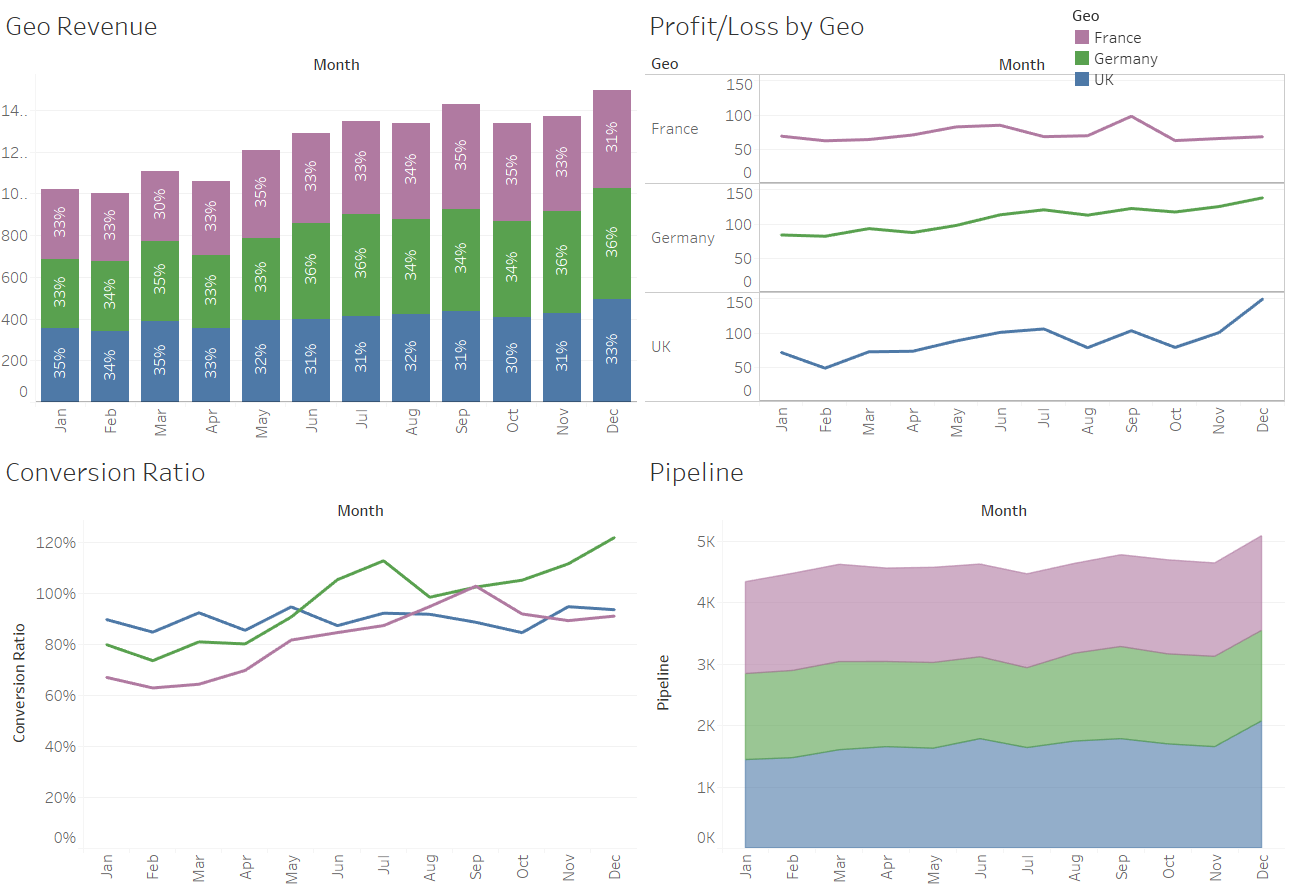
Figure 5: Some example reports in Tableau.
Tactical / Ad Hoc Reports
These reports will be useful to a particular department or group of people. They are custom built to answer one-off questions of the data or answer ongoing questions that may fall away over time, e.g. after the problem has been resolved or the performance improvement made. Sometimes the reports become widely used and relied on, in which case they can evolve into instituted reports.
Example use cases:
- Analysis of particular areas / departments of a business
- Provide deep dives into particular areas of the data
- Provide additional insight into areas of the business
Tableau is very well positioned to build tactical style reports. The build time can be a matter of minutes, from connecting to the data source to bringing the visualisation to life. Analysis can be performed quickly, and the answer and/or decision can be made straightaway.
In Figure 6, you can see a utilisation report which shows the expected utilisation for each consultant based off a dummy dataset. This might start life as a tactical report, i.e. someone asks the question “I want to know how utilised our consultants are.” The finance team put together a basic dashboard very quickly identifying consultants with low utilisation. It might be used as a one-off, or it could become a standard report that is produced weekly for partners.
Sometimes, it takes random questions to produce something that is incredibly valuable and becomes an integral part of business intelligence.
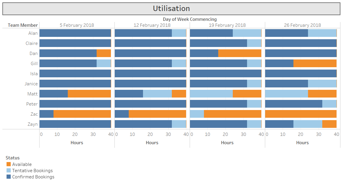
Figure 6: Utilisation dashboard.
Informative Reports
Tableau is not just about producing financial reports. For example, a consulting practice may have numerous consultants who speak different languages, have different certifications and have different industry experience. It can be very useful to have a dashboard where you can see that all in one place.
In the dashboard shown in Figure 7 below, you can type in a name or a skill into the search box and Tableau filters the data down to the specific consultants with those skills. The search takes seconds and probably saves a number of emails going back and forth between operations and sales, discussing who has what language skills and certifications.
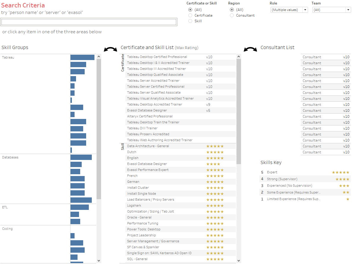
Figure 7: Consultant skills dashboard.
You might have parts of your dataset that aren’t financial or numbers based. Tableau can connect to many datasets, it just takes you to try it out and see what it can do.
To Conclude …
There are many possibilities with Tableau. Remember to be focused and clear about what you want the output to be. Today, finance teams can be more adventurous, more innovative and more visible. Using modern technologies like Tableau, your teams can help improve performance, unlock insight from the data and foster strong collaborations across your business. Try out a trial download of Tableau to see for yourself.