
Every day, we are flooded with data visualizations. Whether it’s a bar chart in a newspaper, an infographic you see online or a pie chart you see in a quarterly earnings report, people are turning numbers into pictures all around us. For those of us that love to discover, these visualizations can be a great way to gain a unique insight into something. Unfortunately, with this increased volume of visualizations, there’s a deluge of visualizations that aren’t as high quality as they could be. Often times, I find myself looking at a visualization trying to figure out what it’s trying to say instead of learning what it’s saying.
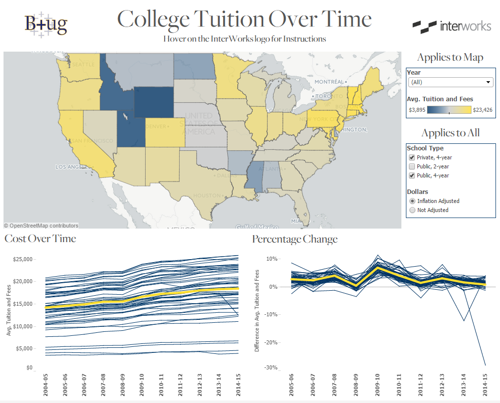
If you keep these three tips in mind, you can ensure your viz will drive traffic and keep your users coming back. This guide is made with Tableau in mind, and some of the ideas I’ll mention will be Tableau specific, but these are largely ideas you can use regardless of your software of choice. As a starting point, I’ll be using the Viz of the Day from November 26. View the full post with all visualizations here.
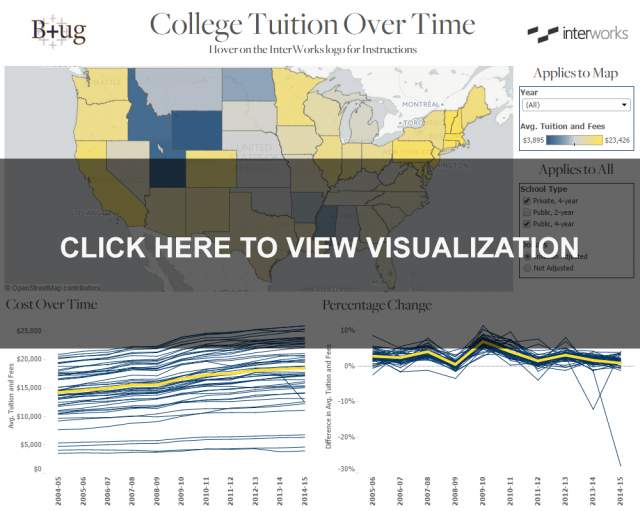
After taking the same data and following the tips I mention throughout the rest of the article, I end up with this. Click on the image below to interact with the visualization:
1. Ask The Right Questions
Before we even think about how we want to display information, we have to make sure that what we’re creating is going to answer the questions that we expect our users to be asking. In my eyes, the biggest weakness in the original post is how difficult it is to compare changes over time between different states. The only visualization that has this is the heat map, and that lacks any information on dollar amounts. I know the purpose of those dashboards is to show different ways of explaining data, but that is a crucial piece of information to be missing on three out of the four dashboards. A great dashboard will not only answer the questions a user expected to have but answer questions they never thought to ask originally.
2. Make It Relevant
Everyone wants an experience that is geared towards them. Whether it is the results you get back from a Google search or the music that comes on from Pandora, relevancy is incredibly important. When you’re making a visualization, there are dozens of choices that you make that should be affected by knowing your audience and making things relevant to them. From the size of the dashboard to the colors and fonts you pick, everything can (and should) be tailored to your users.
Colors are pretty easy in this case. This dashboard was originally presented at the Berkeley Tableau Users Group, so I made the colors fit UC Berkeley’s color scheme by using the new Pick Screen Color function in Tableau 9 available in the Edit Color window. Fonts are a bit more difficult. Many Tableau users (myself included) don’t put as much emphasis on font as they should. The original dashboard we started off with used the default font (Trebuchet) throughout. While there is nothing inherently wrong with Trebuchet, we have a heavy association between fonts and meanings. If that wasn’t the case, these two movie posters below wouldn’t seem so out of place.
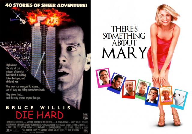
“Die Hard” doesn’t seem like it will be so action packed when the title is written in Comic Sans, and it doesn’t feel like you’re going to find yourself rolling in the aisles with laughter when “There’s Something About Mary” uses the font from “Game of Thrones.” I ended up using the Freight font (as directed by UC Berkeley’s branding site) as often as I could. Since fonts are rendered client side, once they’re published out to Tableau Server or Tableau public, it won’t render correctly anywhere the font isn’t installed, meaning custom fonts (like Freight) can’t be used throughout the dashboard.
What you can do, is take a screenshot of the title texts and embed them as image files instead of text boxes on your dashboard. This obviously won’t work for dynamic texts or anything within the visualization itself, but it certainly helps to add some relevancy to dashboard titles. There are tons of ways to make your visualization relevant, and many organizations have their own style guide that you can use to help your dashboard fit in with existing content.
3. Make it Unique
While a big emphasis of the last section was about making something relevant and, to some extent, making something “fit in,” that should be balanced by the need to make something special. If you’re making a report for internal use, you’re competing for your audience’s eyeballs with every other report, email and PowerPoint that they’re supposed to check.
If you’re making something online, you’re competing with every other reporting tool imaginable. If someone is going to choose to A) take time out of their day to learn about the subject matter you’re reporting on and B) pick your report over the litany of other similar resources they likely have available to them, your report better have something that sets it apart. In this particular chart, I used a custom map (I discuss how to do that easily here).
There’s no shortage of ways to do similar things in other visualizations. Whether you take advantage of URL actions to bring up relevant information from the web or leverage Tableau’s ability to compare disparate data sources, which would have otherwise been impossible, you can always find a way to make your work stand out.
No matter who our intended audience is, whether it is a few coworkers or as many people as you can reach online, we always need to be aware of how our choices on aesthetics affect consumption of the final product. While this is no way an exhaustive list, this is hopefully a starting point or at least includes some things to keep in mind when you go to build out your next visualization.
The Latest
-

Kickstarting Data Innovation in Healthcare
18 April, 2024