In this installment of The Quantified Car series, I want to discuss path maps. We know that Tableau can draw polygon or filled maps, but it can also draw points on a map using circle marks. Path maps are used to draw lines between those mapped points. I used this technique for my driving data to draw lines between the start and end locations of each trip.
Structuring the Data
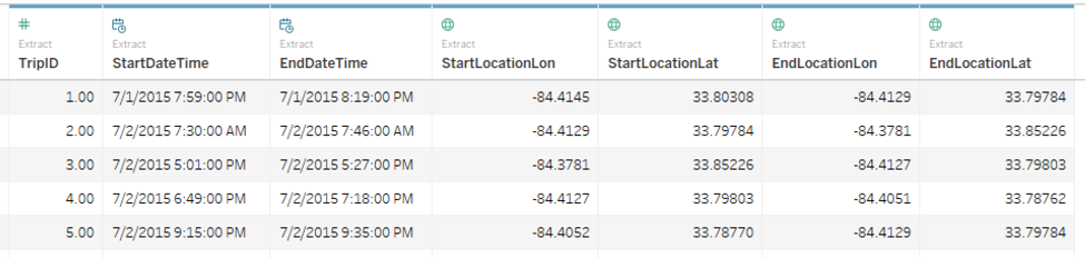
Path maps require our data to be structured in a very particular format. My original data was written at the Trip ID level. Every row was an individual trip, with data about that trip (average fuel efficiency, duration, distance, etc.) included with each start and end location’s latitude and longitude:
However, for path maps to work, we must pivot the data so that every row is a single location on a path, not a distinct trip. Ultimately, we need the data to look like this:
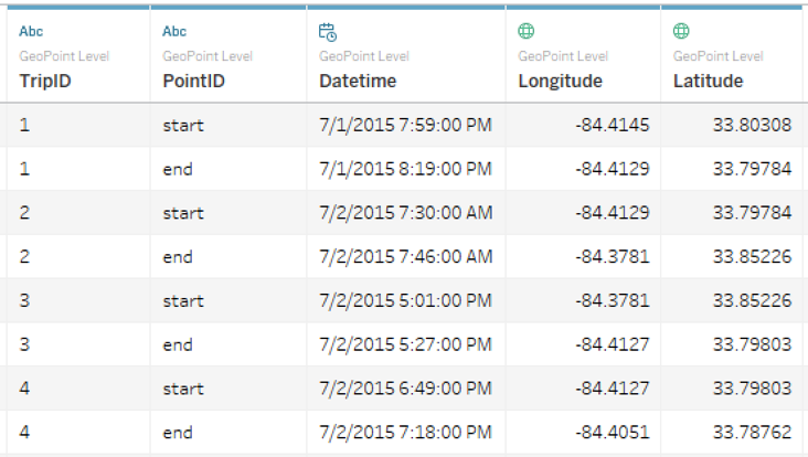
It may seem odd that the TripID field is duplicated, but in this case that’s exactly what we want. We’ll use this to tell Tableau that these start and end locations belong on the same path. It’s also worth noting that you can do this with more than two points. You can draw paths from any number of distinct points. Just remember, each point must be in its own row with an ID field to link them together.
Building the Map
Once we’ve unpivoted the data, we can build the view in Tableau. We’ll start by adding Latitude and Longitude to Rows and Columns, then right-clicking on their pills to convert them to dimensions. I’ve also added some filters to clean up the view.
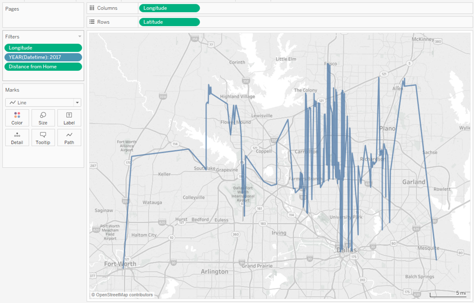
To make our path map, we simply change the mark type from Automatic to Line. Our result is a single line connecting every data point, which is not the goal:
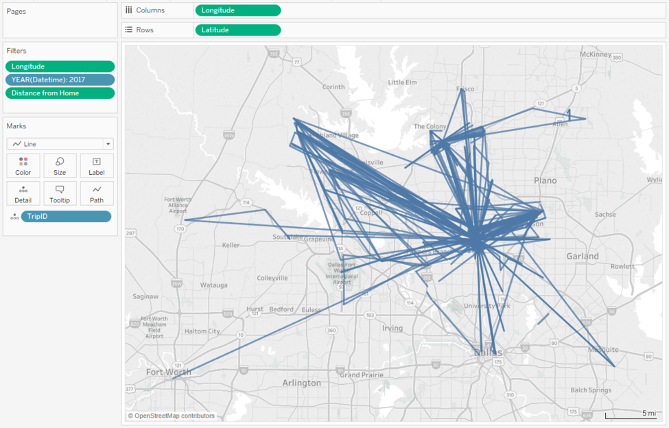
We can resolve this by dragging the TripID field to the Detail button of the Marks card. Now, Tableau draws one path for every distinct TripID:
Final Touches
Now that we have the path map set up, we can manipulate these marks further. For this particular view, I added the PointID field to the Size and Path buttons. This turns each line into a long arrow that points in the direction of travel.
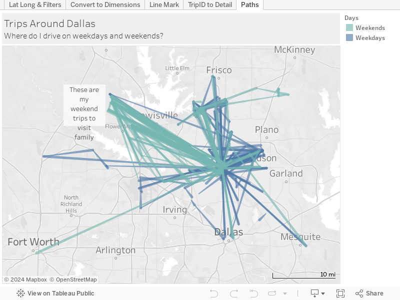
Because views like this can get crowded very quickly, it can be helpful to call out additional patterns in the data. So, I created a custom date part for weekday. I grouped Saturday and Sunday into an element called Weekends and grouped the rest of the days into Weekdays. When this is added to Color, it immediately calls attention to my weekend trips to the northwest for family visits
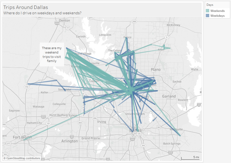
And that’s it for this week’s post! You can see the final dashboard on Tableau Public below. Stay on the look out for the next Quantified Car blog.