
Not everyone is a Tableau guru, at least not yet. To help Tableau rookies, we’re starting from square one with the Tableau Essentials blog series. The series is intended to be an easy-to-read reference on the basics of using Tableau Software, particularly Tableau Desktop. Since there are so many cool features to cover in Tableau, the series will include several different posts.
Today, we’ll look at some formatting ideas that you can use on your next visualization. Specifically, we’ll look at using custom shapes to serve as our marks.
Here is a simple table illustrating where players from the 2014 World Cup play their club football:
- Club Location field on the Columns shelf
- Players field (with aggregation set to Count) on the Rows shelf, which gives us the blue vertical bars
- To get additional marks in our view, I created a dual axis by dragging a copy of the Players field to the Rows shelf and selecting Dual Axis (right-click on the right axis, select Synchronize Axis and unselect Show Header to only display the axis on the left). Now that I have a second axis, and thereby a second Marks card, I put the Club Location field on the Shape shelf and am showing the default shapes in the view below.
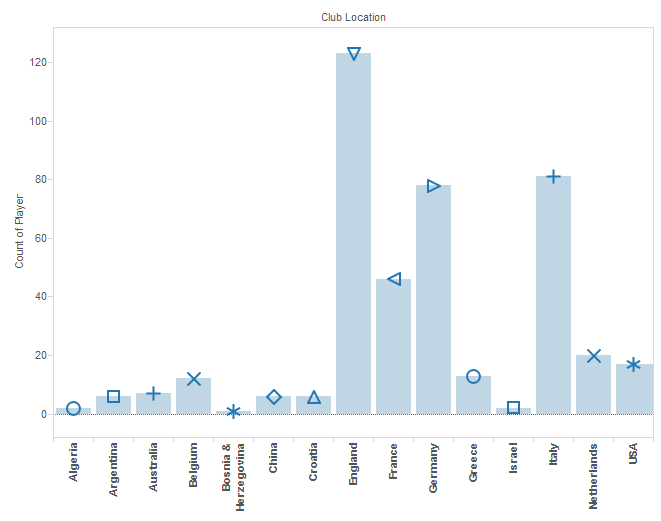
There are two problems with this view. First, there are more countries than there are shapes, so we have several repeats. Secondly, this visualization is pretty boring. We’re using Tableau, and the expectation should be that our charts and tables pop. So, let’s add custom shapes to give this table a more professional and exciting look.
First, you’ll need to gather your images. However you prepare your images, you’ll need to place the finished product in the My Tableau Repository folder, which you will find under Documents on your computer – specifically in the Shapes folder. You can create your own folder here (for this example, I created one called My Custom Shapes), which might be a good idea if you intend on using a lot of different sets of custom shapes for your visualizations.
For the World Cup view above, I’m going to use little flags like this one:
![]()
As a best practice, make sure you use an image type that supports a transparent background (such as a *PNG). Your visualization will look much sharper if your custom shapes sit seamlessly on your data without a white background.
Go back to the marks card within Tableau Software and click on the Shape button.
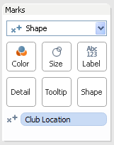
You’ll get the Edit Shape dialogue box.
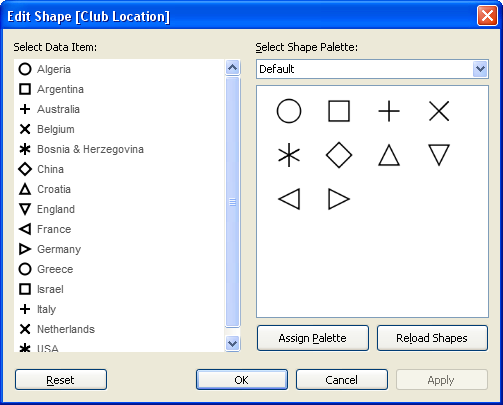
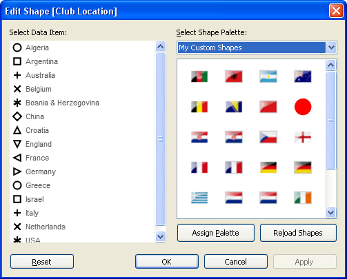
Click on the Select Shape Palette drop-down menu to find My Custom Shapes.
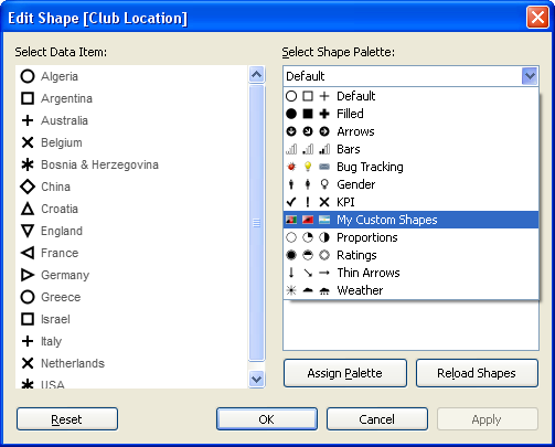
This is where we stored all of our shapes in the My Tableau Repository folder in My Documents. You should see all of your custom images in the box below the drop-down.
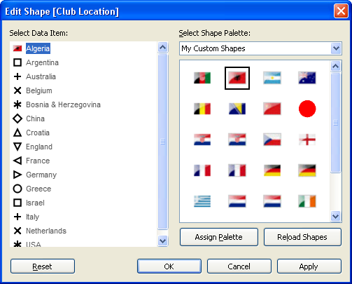
Now, simply select your data item and click on the image you want to assign it. Let’s do Algeria below:
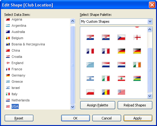
Continue through all of your data items until you have assigned all of the custom shapes you need to complete your visualization. Like so:
Click Apply. Let’s see how our original view has improved with our new custom shapes.
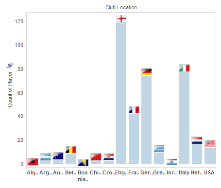
Now that we’ve got country-specific marks on each data point, we don’t need the x-axis labels any more. Those labels were forcing our table to be larger than necessary for legibility. With the custom symbols, we can create a much more compact table that is still much more visually compelling than using the default symbols.
Also, our little table is now a perfect size to be included as one element on a dashboard.
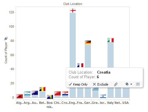
And, if you’re like me and you need the occasional brush-up on your flags of the world, simply mouse over the data point and a tooltip will appear, as always, with further details.
Using custom shapes as marks is just one of the neat little tricks you can use in Tableau Software. As you can see, they add a little something extra to what was once a fairly ordinary chart. The possibilities for custom shapes are numerous, so have fun playing around with some of images of your own.
Formatting Tips
Below is a complete list of Formatting Tips posts that can help you transform your vizzes into works of arts. Check back frequently for new additions.
More Tableau Essentials
Want to learn more about Tableau? We have several posts outlining all of Tableau’s fantastic features. Check out the full list on our Tableau Essentials blog channel.
As always, let us know if you have any questions or comments about this post or Tableau in general. If you’re looking for personalized training or help with something bigger, contact us directly!