
On election night every two years, major news organization compete for the best presentation of vote results. Data consumers are particularly drawn to red and blue colored maps. In recent years, there have been some impressive variations on mapping techniques, many of them aimed at presenting winners in ways that don’t distort our perception.
The Misperception of Size
When using filled maps, larger geographic areas can appear to have more impact than they do in reality. For example, the state of Alaska has only one representative while smaller states in the Northeast have far more due to their population. On a filled map, Alaska appears to have more representatives strictly due to its land mass.
There are several ways to avoid this kind of misperception: varying color intensity, using dots to represent votes per capita or even distorting the states with specialized algorithms. Data journalists usually augment the map with a layout of congressional seats or simple bar charts to ensure visual accuracy. I thought I would share my take on another way to solve this problem using Tableau.
Interact with the visualization below:
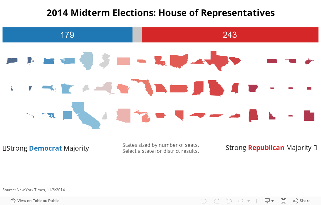
Here, states are sized appropriately based on the number of Congressional Representatives (a good proxy for population). We can also sort and color them according to how strong the majority is in that state. This ensures a more accurate visual representation while preserving the familiar state geographies.
Tableau Tip
The state shapes are, in fact, a Filled Map mark type in Tableau (not custom shapes). You can learn more about filled maps in this post by my colleague, Carly Capitula. After creating a filled map using Show Me and an appropriate geographic dimension, remove the generated Latitude and Longitude values from the Rows and Columns shelves. From there, it’s possible to lay out the states according to any other dimension or measure.