
Last time out, I created a very simple and straightforward dashboard based on my family’s finances up to this point in the year. You can find that original dashboard here.
While I’m all about making things less complicated than they need to be, I thought it might be fun to it up a notch and make it interactive. That’s what Tableau is all about! Interacting with your data to either dive deeper into it or to call out details that are otherwise lost in the crowd is a great way to take things to the next level.
A commenter who shall remain nameless (Hi, Eric!) pointed out that it might be fun and useful to see the distribution of circles in the circle graph limited to only one category. Lucky for us, Tableau has these wonderful little things called Action Filters that will help me do just that. I’ve included the full viz below, followed by step-by-step instructions on how I added these filters.
Click on the image below to interact with the visualization:
How It’s Done
What I want to do is have the user click on any square in the tree map and have the circles in the circle graph show only the marks that correspond to the chosen category. How do we do that? Just like this:
- While on the dashboard in Tableau Desktop, choose Dashboard — > Actions from the menu.
- Click “Add Action,” and choose Filter. We want to filter our circle graph based on our selection, so we choose that type of action.
- Give your filter a meaningful name so that if you need to edit it in the future, you’ll be able to tell which action to select. I entered Filter Circles as the name.
- Here is what the Edit Filter Action dialog box looks like for what I’m trying to do:
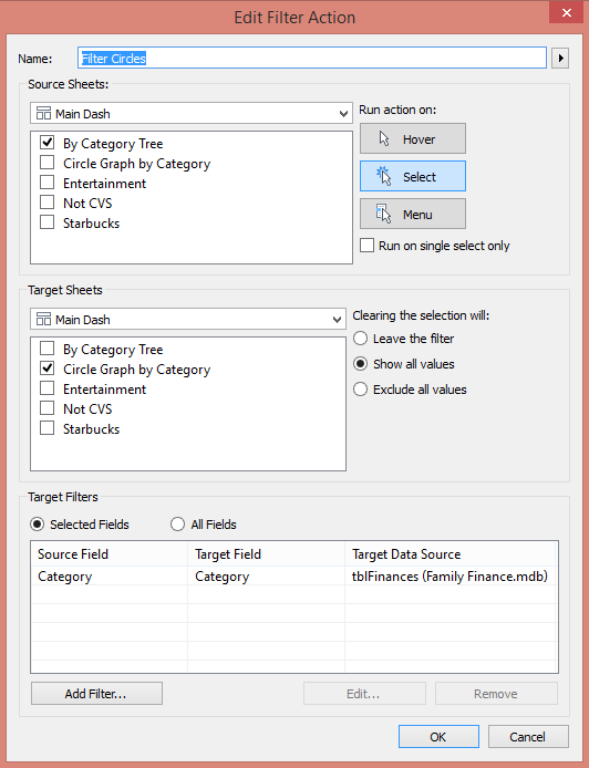
I’ve told Tableau that when a user selects a category from the By Category Tree worksheet, it will filter the Circle Graph by Category worksheet and select only that category. Simple!
Here’s what that looks like on the dashboard when I click on the Entertainment category square:
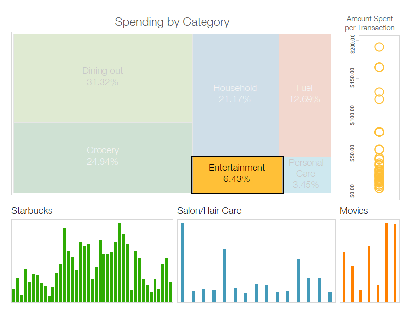
Note that only the yellow circles corresponding to the Entertainment category now show. This gives the user the ability to look at individual data points for a particular category of their choice, something that is much harder to do when the circle graph is unfiltered.
Let’s Go On a Monthly Date!
The bar charts along the bottom of the dashboard are all broken out by week. I thought it might be fun to throw a parameter in there to allow the user to select an entire month and filter the bars for just that month. Just like being able to filter the circle graph to show details about a particular category, filtering the bars by month might provide more insight into which months my wallet takes the biggest hit.
This process is a little more involved than a Dashboard Action, and the purpose here is to give an example of how to step up a simple dashboard rather than to explain the concepts of Tableau features. For an excellent description of how to add a date parameter, I’d like to direct you to this blog by my colleague, Nicholas Laurenti. What he’s explaining is exactly what I did!
Here’s a look at what happens when I filter the bars by the month of May:
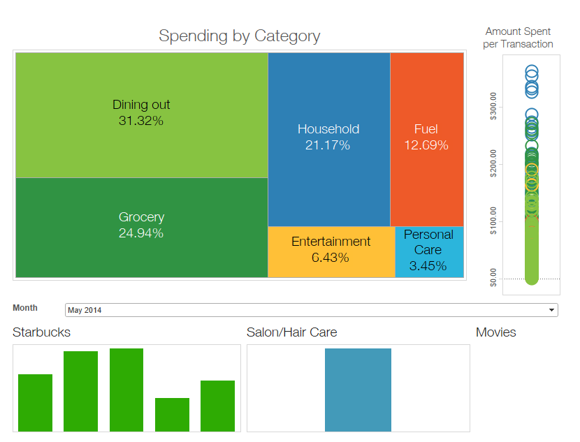
It’s readily apparent that my Starbucks addiction is still in full force. What you also see is that there was only one visit to the hair salon. Either I was allowing the grays to completely take over or the boys were sporting a pre-Summer shag. In the Entertainment area, I’m guessing there wasn’t anything out at the movies that tickled our fancy?
If I change the month to August, however, we see this:

I still went to Starbucks weekly (I can see the shock and awe on your face), but I guess we were all sporting new hairdos for the start of the school year because we went to the salon twice. And check it out – we even went and saw a movie!
There’s nothing in the world wrong with simple and straightforward dashboards that provide useful information to your users. But with just a few quick additions like Dashboard Action Filters and Parameters, you can allow your users to reach out and touch your data. This enables them to drive their own research.
Now, if only Tableau could cure the need for Starbucks …