
Whenever I get the chance to introduce someone to the world of Tableau, one of the first things people tend to fall in love with are the tooltips and the ability to quickly view the underlying data of a mark. The default tooltips in Tableau are a great starting place to quickly see details about marks, and to satisfy the “Show me the numbers” people, while still maintaining a clean presentation of the data. However, the default tooltip can be tricky to read, with the light grey default text on a white background. The default tooltip can also become cluttered with dimensions and measures that are unnecessary to the data.
Changing the default tooltip in Tableau is simple but an often overlooked during dashboard design. Creating tooltips that help tell the story with your data is a simple extra step to just deleting the unnecessary dimensions and measures from the tooltip. I will show you how to begin changing your tooltips, making them visually appealing, creating dynamic tooltips that change based on what mark you are hovering over, and an alternative to allowing the user free reign of the data using the View Data button on the tooltip.
Beginning to change the default tooltips:
For those of you who have never changed the default Tableau tooltips: tooltips are unique to each worksheet in your workbook and they can be changed by clicking the Worksheet dropdown from the top menu and selecting the Tooltip option. (In Tableau 8 this menu is more quickly accessible from the Tooltip box on the marks card)
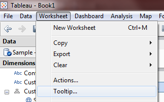
Editing a tooltip is almost identical to making changes to mark annotations. By default, Tableau will display all dimensions and measures used on your worksheet in the tooltip. You can insert various other fields into the tooltip using the Insert dropdown located near the far right side of the tooltip editing window. You are restricted to inserting dimensions and measures that are used in the worksheet you are creating. Tooltips can also be defaults by click the Reset button at the bottom left of the edit window.
Making your tooltips visually appealing:
While the default tool tips in Tableau update automatically with all relevant Dimension and Measure fields, they can be difficult to read with the default grey field descriptions on white background. When designing a dashboard for others I always recommend editing the default formatting. Tooltips are a great way to help tell a story with your data without relying on large blocks of explanatory text on your dashboard. Legends can even be saved with clever usage of tooltips. All of this helps maximize your data per pixel ratio (more room for data rather than explanatory text).
Just a few examples:
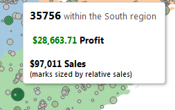
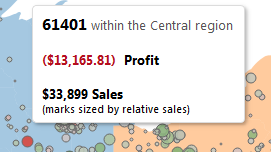
Dynamic tooltips based on mark selection:
In the screenshots above you can see that positive profit zip codes show profit in green, while negative profit zip codes display the profit value in red. Though we could of course argue the merits of red and green coloring there is only a slight amount of extra work to make our tooltip more appealing to the dashboard consumer. You can see the specific calculations used to accomplish this effect in the attached workbook. Tableau 8 also allows for tooltips per pane but the same effect can be accomplished in version 7. If a line in a tooltip can’t evaluate, the line isn’t printed. See below for a downloadable example:
View Data alternative:
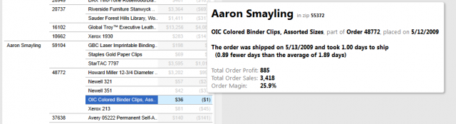
You’ll notice in the screenshots above that I have removed the command buttons (filtering, grouping, sets, etc). While useful, these can also allow a user to unintentionally break a visualization. The View Data button is useful but exposes columns that may not be relevant to your user. I typically rely on a drilldown dashboard instead of allowing the View Data button. In the attached workbook the user can click a zip code (or box of zip codes) to view the customers and relevant orders within that single zip code. This functionality avoids the need for quick filters which helps the user pick the zip code they want to view faster while also displaying summary and comparison information for each zip code. Action filters (clicking a zip code in this example) also tend to evaluate more rapidly than quick filters (quick filters are the first thing we look for when performance tuning dashboards). A drilldown dashboard with ‘Exclude All Values’ specified in the action filter is especially is an especially great alternative to quick filters on a crosstab due to the time it takes to render thousands of rows of text. In the example drilldown dashboard, once a zip code is selected only the relevant customers are displayed. This keeps the length of the crosstab to a readable length and also draws very quickly. When the filter is cleared, instead of Tableau being forced to render thousands of lines of irrelevant text, it simply clears the view making the next zip code selection much easier.
Hopefully you now have some ideas on how to use your tooltips more effectively, stay tuned for more tips and tricks!
The Latest
-

Fabric Governance: Content Certification and Deployment
17 April, 2024 -

Fabric Governance: Content Organization and Subdivision
17 April, 2024 -

Fabric Governance: Users, Licenses, Roles and Capabilities
17 April, 2024