Quantified Office is a series in which we tackle interesting methods of data collection, analysis and visualization to quantify activities at InterWorks' offices.
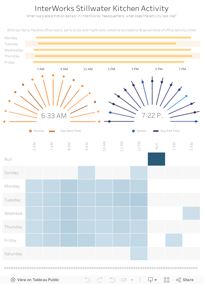
In Part 1 of this is series, I explained the general premise behind our Quantified Office dashboard. In this part of the series, I’ll explain why we chose a visualization type called the “sunrise chart” and show how we created it. I’m the first to admit that the sunrise chart in our dashboard doesn’t give us very valuable information. We wrapped bars around a semi-circle – you definitely can’t get any information out of it easily.
That being said, it isn’t particularly meant for information. It does happen to contain the daily start/end times, paired with sunrise/sunset data. It is, however, a fairly pretty art project. More importantly, it is a great example of what you can do in Tableau if you set your mind to it! Besides, it pairs very well with the data, as we are indeed monitoring sunrise/set times.
Best practices aside, you may have a good use for a similar chart. The idea for this chart is born from a blog post written by Dave Hart, an InterWorks consultant out of the UK. Dave wrote an interesting piece on a Radial Bar Chart. Adapting Dave’s method, I created the semi-circle used in the dashboard below. I will show you how I created this and you can decide on the ethics of using it in your dashboards.
The Math Theory
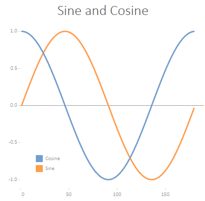
Thinking back to trigonometry classes in high school, you probably vaguely remember the concepts of sine and cosine. If you did much graphing of them, you will remember they create semi-circle arcs that complement each other on a graph.
We can graph this using the calculation below for our radians, where x is a point on our line and t is the total number of objects:
(x-1)*(1/t)*2π
Or, in Tableau:
([x]-1) * (1/{MAX([x])} * 2 * PI()))
These functions, while fairly arbitrary in school, have amazing uses in the real world. In our example, we can graph sine against cosign on a simple X/Y axis and we get a circle!
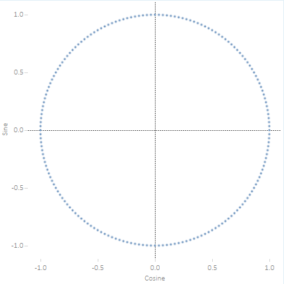
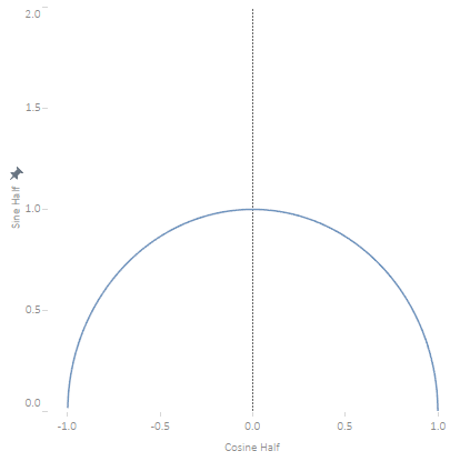
While this example gets us a full circle, what we are really going for in our graph is a semi-circle. Our original query utilized the full sine and cosine wave, but for a semi-circle we only need half of it. Luckily, a quick modification to our calculation allows us to use only half of the circle:
(x-1)*(1/t)*π
Or, in Tableau:
([x]-1) * (1/{MAX([x])} * PI()))
How It’s Done
Now that we’ve covered how to map out a semi-circle in Tableau on an X/Y plane, we can start to build out our graph. In this particular use case, I wanted lines to serve as the “rays” on the sun. To do this in Tableau, we will want to use path mapping.
Basically, we want our data to be duplicated with two points – one at the beginning of the line and one at the end. Using some math, we can find a new X/Y coordinate for the secondary point location. The third point is our sunrise time. Go find the sunrise data for your dates and use it for the third point.
But before we get too far, let’s do some data preparation. This isn’t necessary – we can do all of these pieces in Tableau – but greatly simplifies the Tableau processes involved.
First, I converted our timestamps to seconds. This can be achieved by a simple formula:
(Hours * 3600) + (Minutes * 60)
For our Tableau calculations, we will also want a couple of auxiliary fields. These can be calculated in Tableau, but to simplify the math I just point them in Excel. In the attached Sunset.xlsx file, you will see these fields. They include the following:
- Index – This is a simple INDEX() type field that applies to a subset of our data, restarting for each Path. An index of 2 will match up with the other three path points at Index 2.
- PathOrder – Which dot on the path is this record? If 3, then this is sunrise data. Otherwise, it is one of the duplicated data points.
- Max Daily Entry – Maximum timestamp in our data. This is used for calculating the size of our line.
- Min Daily Entry – Minimum timestamp in our data. This is used for calculating the size of our line.
Now that we have our data formatted, let’s move over to Tableau!
We will need a small handful of calculations in Tableau to determine where to map our points.
- Normalized Length – Calculates the length of our bar. If we are at our original point, this simply returns our starting point: .4. Otherwise, it determines where our point should go. (The .4 is to create the inside whitespace. You can reduce this to make the whitespace smaller or larger as desired.)
.4 + IIF( [Path Order] = 0, 0, (INT([Daily Entry])-([Min Daily Entry]/2))/([Max Daily Entry]-([Min Daily Entry]/2)) * (1-.4) ) - Radial Angel – This is the radian we pass into SIN() or COS(). It more or less cuts up the semi-circle into pieces, depending on how many data points you have.
([Index]-1) * (1/([Total]-1)) * PI()
- Radial X – Our X axis. Cosine is used for this calculation.
[Normalized Length] * COS([Radial Angle])
- Radial Y – Our Y axis. Sine is used for this calculation.
[Normalized Length] * SIN([Radial Angle])
- Is Sunrise/Sunset.
[Path Order]=2
Now that we have all the pieces, we simply need to assemble them! Select Line in the Marks area of a new chart. Then, simply drag Radial X to Columns, Radial Y to Rows, Is Sunset/Sunrise to Size and Path Order to Path. Make sure Radial X and Radial Y are continuous (green). If they are not, then right-click on the pills and select continuous to change them.
And there you have it – a sunrise chart! I’ve attached all of the pieces, so feel free to dig into them if you wish to dissect the chart more. Make sure to keep an eye out for Part 3 of our Quantified Office series, where we share how to obtain data from the motion sensor.