
Dan Murray explores three core areas of data and shares insight into how we should think about each in order to work with data more effectively.
In Part 1 and 2 of this series, we explored data science and big data. In this post, I’ll discuss how data visualization helps people makes sense of what data scientists are creating and storing. Whether the goal of the visualization is to expose a story like a journalist or to provide insight for a business manager, data visualization makes the data being analyzed concise and understandable.
I’ll also discuss dashboard metaphors that were never useful to begin with and have since become clichés. Dashboards created by the old-school market leaders took the car dashboard metaphor too literally. They overused speedometer-like gauges and even included annoying sunlight glare as a feature.
Proust on Clichés
I recently finished an great book by Alain De Botton called “How Proust Can Change Your Life.” Mr. De Botton describes how you can learn about people by what annoys them. Proust was annoyed about how some people expressed themselves, particularly the mindless use of clichés.
“Clichés are detrimental insofar as they inspire us to believe that they adequately describe a situation while merely grazing its surface … how we describe the world must at some level reflect how we first experience it.”
The reason I bring this point up is that traditional BI tools provided that were cliché. They directly copied the designs used in airplanes and cars. These tools failed to communicate what is important. Stephen few has criticized these tools because they fail to convey the information effective. They are cliché visualizations (gauges, pie charts, etc.).
Impressionism and Metaphors
Metaphor and simile can be used to enlighten ideas or they can result in mindless situational repetition. De Botton uses impressionist and realist painting styles to illustrate this point further. The painting by Claude Monet called Impression Sunrise is referenced as an example.
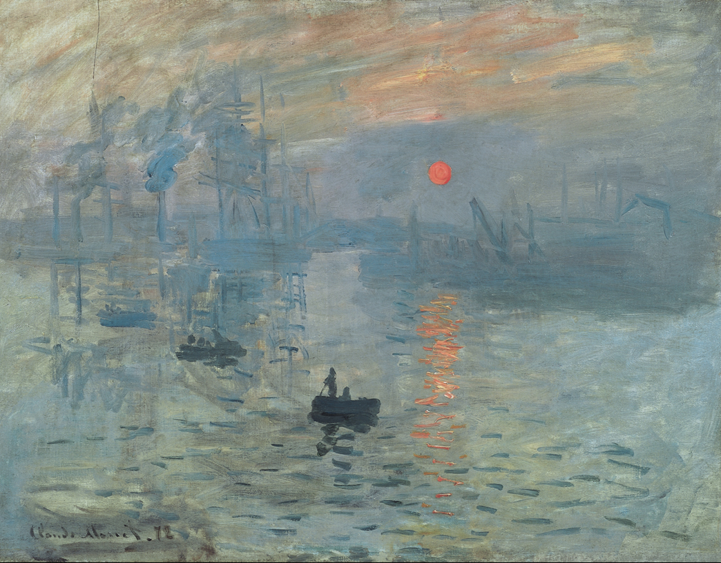
When Impressionists first came on the scene their work was ridiculed as incomplete and lacking technical proficiency. What the establishment failed to recognize was that impressionists were trying to convey something different than the photographic-like painting style of the time: realism. Impressionists were attempting to show the feeling of the scene.
Monet’s painting was an original interpretation of a setting that was rejected initially because it didn’t fit established norms. As De Botton says:
“If his work seems unusual, it is because he is attempting to paint something of what we actually see when we look around, rather that what we know we see.”
In a similar way, writers use metaphors and similes to convey can idea. Some clichés:
- Low-hanging fruit
- At the speed of light
- No guts, no glory
- Under the gun
- When push comes to shove
Using these worn-out phases gives the impression of creative insight yet they merely provide the most shallow form of communication. Taking the time to create your own metaphor or simile is novel and provides personal interpretation. This is what makes writing interesting.
How Does This Relate to Data Visualization?
Great data visualizations convey what is important in data by distorting transforming data into meaningful two-dimensional views. A good data visualization tool like Tableau provides an environment for experimentation by people that are subject matter experts and not necessarily data experts. These newcomers can create compelling new ways of interpreting data like this visualization by Matt Chambers on body camera laws, or this analysis by John Keltz on Georgia Colleges, or this Brittany Fong analysis of presidential candidate tweets. Some of the most creative Tableau dashboards I see are made by people with limited database skills and limited Tableau experience.
The influence of new people creating visual analytics is generating new and interesting metaphors. There is an element of novelty that different visualization styles provide that is thought-provoking.
Data visualization can be impressionistic or realistic depending on the author’s insight and objectives. Like a beautiful painting or a novel turn of speech, data visualization can be used to convey a particular point of view or factually report what has happened.
Data Visualization vs. Infographics
I’ve always been drawn to using charts to convey what I find in data. My early training was in accounting and finance. I enjoy digging into the numbers as much as anyone, but I always got the biggest thrill when I was able to find something in the data that nobody had discovered before and then share that finding in a way that was appealing to others who are less technically inclined. Lotus 123 was successful in the early 1980’s because it incorporated charting tools.
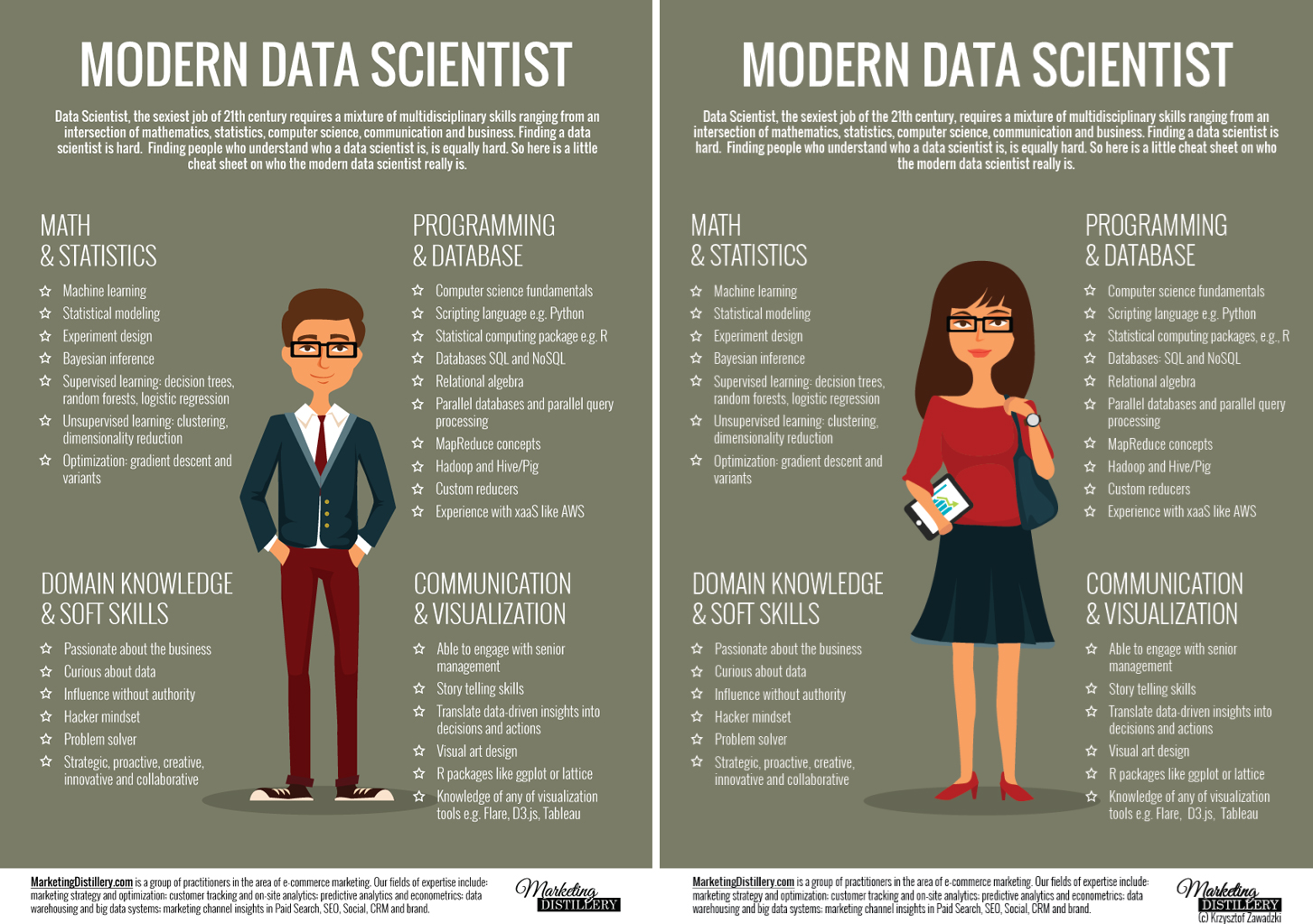
I view data visualization as the realistic interpretation of data while I think infographics can be used to example many different aspects of a topic while also providing novel stickiness. Below is an example of a good infographic that I’ve used in recent presentations. For good examples of data visualizations, look no further than our Viz Gallery.
D3 and Tableau
I have been lucky to attend Tableau’s Tapestry Conference the last two years. What I enjoy about this event is that it takes me way out of my comfort zone. In journalism, editorials seek to convey a point of view. Exposé seeks to convey facts (sometimes shocking) about a story. Data journalism can be used to reinforce the ideas presented in either style.
D3 is a fantastic tool that can convey an wide variety of visualizations provided the user has coding skills. Tableau provides fewer visualization options but doesn’t require a lot of technical skill to master. Both tools have their place for storytelling. I think Tableau is a better tool for discovery work because it is more accessible to non-technical users.
D3 Data Visualization Examples
If you explore the D3 website you will find a fantastic array of example visualizations. This is one reason why the use of D3 in data journalism is more widespread than Tableau. The economics driving the creation of these intricate stories supports the hiring of technical resources and funds relatively time-consuming development.
I’ve seen some amazingly intricate visualizations at the Tapestry event that required teams of experts coders months to create. The results are used to tell detailed and engaging stories that are meant to hold people’s attention.
This “New York Times” story uses Sankey diagrams to show migration patterns in the United States. Check out these link if you want to see some other fine examples of interactive journalism from the NYT, the “Wall Street Journal” or the “Washington Post.”
It makes sense for these news organizations to spend a lot of time creating interactive data stories. They drive sticky web traffic. Data journalism’s goals drive intricate, engaging and beautiful visualizations. D3’s ability to create a wide variety of effects justifies the high barrier to entry because the goals justify the higher time learn the tool and create the content.
Tableau Examples
Tableau doesn’t enable as many visual styles. Although advanced users can create more advanced visualizations. Here’s another dashboard created by Robert Rouse that provides a interactive view of every MLB Baseball pitch.
Tableau has a growing presence in data journalism because it enables fast and easy analysis of a topic for journalists that lack coding skills. This is useful for reporting daily events. It’s also attainable for small local newspapers that lack the resources to hire specialists.
Tableau and Data Source Variety
Perhaps Tableau’s most significant value is it’s ability to bridge different data sources without the need for specialized coding skills. Tableau can connect to a wide variety of data sources. Tableau’s data interpreter makes processing information from poorly-formatted sources easier.
Data scientists use Tableau to visualize data from R or Python. Those accessing big data can use Tableau to access data stored in Hadoop.
Creating Your Data Visualization
While data visualization isn’t quite as buzzy as data science and big data, I’d argue that visualizing data is the most important end point for any use of data. D3 provide a rich and diverse tool set that coders can exploit. Tableau provides an accessible entry point for non-technical users. There is value in both tools.