
It’s entirely possible that one must be a country music fan (Kenny Chesney, generally, and his song “No Shirt, No Shoes, No Problem,” specifically) to understand the reference in the title. I’ll grant that up front! But whether you are or aren’t a fan, when you see the awesomeness to which the title refers, you’ll:
- Decide to become one
- Want to put isolated states and countries into every dashboard you create from this point forward
It all started when I saw this blog post from my colleague Robert Rouse. Not only is it pleasant to look at because he’s a Tableau genius, but it had states! All by themselves! Where was the rest of the country? Where was the North American land mass or the bodies of water? What was this lack-of-a-map wizardry that he brought forth, and why was there not more fanfare?
Fans? Consider this your fare.
What happened here is a little known phenomenon I like to call “No lat, no long, no problem.” The solution to getting your states to appear isolated, as in not shown within the confines of the country to which they belong, involves little more than choosing Filled Map as the mark type and removing the Latitude and Longitude fields from the Rows and Columns shelves respectively.
I’ll wait while you absorb all the necessary steps. 🙂
The Usual Process
Normally, when we pull a state or country into a view and put it on the Detail card, Tableau builds us a map because that’s what putting a geographic field on the Marks card does. Let’s dig a little deeper though, shall we? What Tableau is really doing is taking the underlying geocoded data fields of Latitude and Longitude, the ones that correspond to your level of detail, and putting them on Rows and Columns, kind of like it’s building you a scatter plot. In fact? That’s precisely what it’s doing. A map is nothing more than a scatter plot with a custom background image of the globe. Shazaaam! Latitude and Longitude are your X and Y coordinates, and the “graph lines” they are being plotted on just happen to encircle our little planet we like to call Earth.
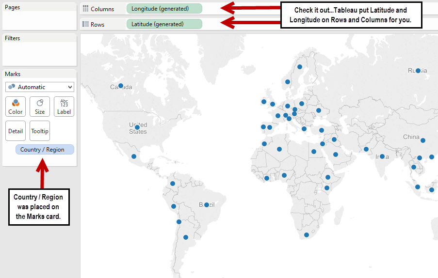
The automatic (or default) mark type selection is a circle, giving you what is referred to as a Symbol Map. So, you have a symbol, in this case a circle, for every point of data in your data source that corresponds to the X, Y or Lat, Long of your level of detail (Country / Region in this example). What do you think would happen if you pulled Latitude and Longitude off of Rows and Columns? Let’s just take a gander …
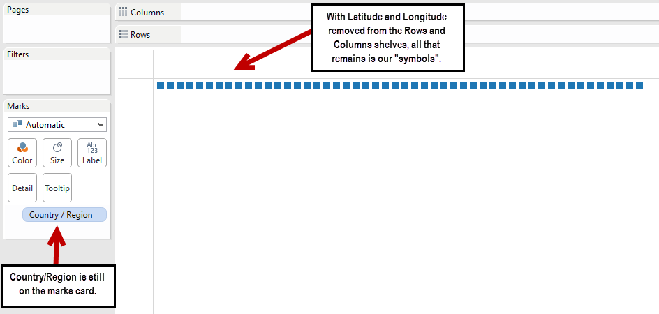
As you can see, Tableau still keeps the “symbol” part (although admittedly, the shape changes from a default of a circle to a square) but loses the background map. Your X and Y coordinates are gone, so now Tableau is simply displaying a mark for every Country / Region.
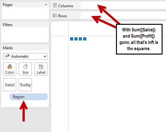
You can repeat this behavior by creating a simple scatter plot using Profit and Sales from the Superstore Sales Training.xls file that ships with Tableau. Place Sum([Sales]) on Columns, Sum([Profit]) on Rows and drag Region to your Marks card. You’ll get four plot points in your scatter plot. Now remove Sales and Profit from Columns and Rows, and voila! You’ll get four squares, one for each member of the Region dimension, just like you got a square for every member of the Country / Region dimension. To wit:
The Coup d’Etat
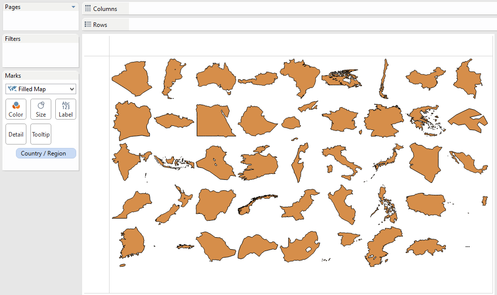
The real wizardry comes in when we take things one step further. All we need to do in our first example up yonder is to change our mark type from a symbol (square) to a filled map. That’s it. Tableau is smart enough to retain the shape of the geographic data, but because your grid coordinates (your Lat and Long) are no longer in the picture, Tableau doesn’t put them on a map. It simply shows you their shape!
How totally cool is that? Imagine the implications. You could filter this chart to a specific region of the world, and you could color by a measure to get really slick gradients. So, if you’re looking to see how Sales compare by country within a certain region, you’d get something akin to this:
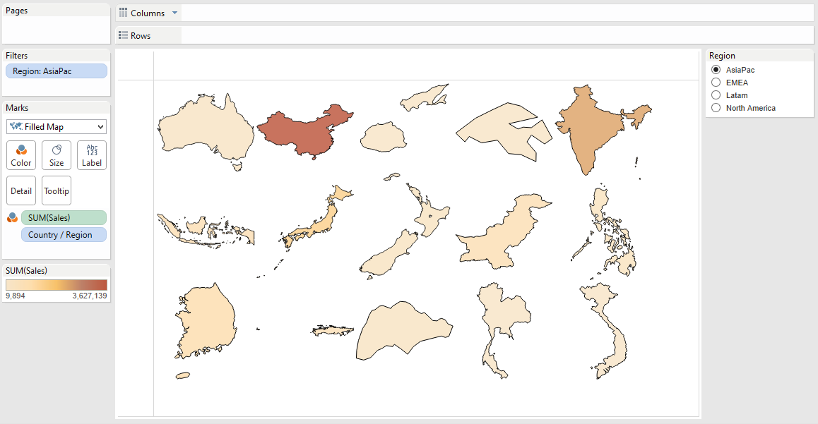
This view could in turn be used on a dashboard as a filter action, drilling down to the sales details for the selected country. The possibilities are limitless! Understanding what’s going on behind the scenes gives you a better appreciation for mapping in general, and it will hopefully spark your creativity to come up with ways to use this trick in your own dashboards. Just beware that it gets addicting. You may find yourself mapping everything on the globe (or off, as it were) from this point forward!