
Not everyone is a Tableau guru, at least not yet. To help Tableau rookies, we’re starting from square one with the Tableau Essentials blog series. The series is intended to be an easy-to-read reference on the basics of using Tableau Software, particularly Tableau Desktop. Since there are so many cool features to cover in Tableau, the series will include several different posts.
The side-by-side circle view is a variant of the circle view. The side-by-side circle allows you to add more measures to be compared next to each other for a richer analysis. To examine the side-by-side circle view, let’s take a hypothetical retail company and use our visualizations to conduct an analysis.
In the circle view below (Figure 1), we’re examining a company’s profit margin (%) by Region, color-coded by Customer Segment:
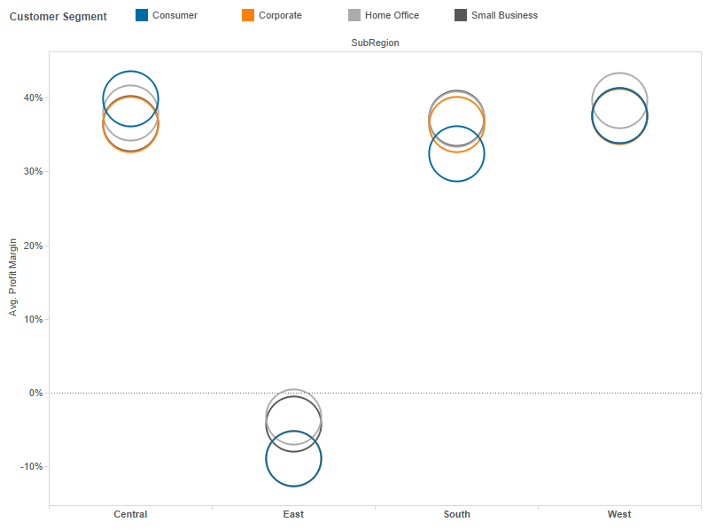
Figure 1: Profitability by Region & Customer Segment.
Immediately, we see that the East is performing very badly and losing money. Let’s use our visualization skills to dig in and learn more about the potential profitability problem in those Eastern states. Let’s filter our view on only the East and expand the detail of the states.
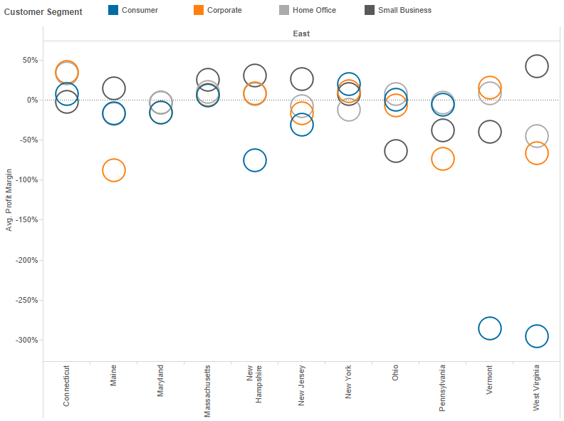
Figure 2: Eastern region by State.
Still in a circle chart, now with a state-level view, we can see that the problem is particularly bad in Vermont and West Virginia for Consumer products. In truth, this hypothetical company is losing money in a lot of different customer segments across nearly all of these states. We are starting to pinpoint the problem, but there is still a bit more to learn.
Now, let’s make our circle view into a side-by-side circle view by breaking out the Customer Segment to our state-level detail. We’re going to add in our product category to see if it is a particular type of product that is losing so much money. For good measure, we’ll create the profit margin mark shape according to the product category (i.e. Ñ, Ë, ¤, etc) and color the marks based on overall profitability (red for loss, green for profit).
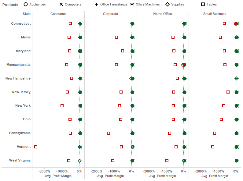
Figure 3: More detail.
The result in our new visualization is crystal clear (I hit the Swap button on the view from Figure 2 and added the Customer Segment field to the Column shelf to better display the labels). The ¤ shape, which represents the Tables product category, is losing money in nearly every customer segment and nearly every single state. For whatever reason, our hypothetical company is losing a lot of money selling tables. This is the type of actionable business insight that Tableau can deliver with only a few clicks.
You can see now how the side-by-side circle view can add a significant level of detail to a standard circle plot. I added color to my mark types and different shapes to make it easier and faster to read. In other words, my story is very clear and concise to the viewer of this visualization because of how I organized and formatted my chart. As you delve into more complex types of charts, formatting becomes more and more important to avoid clutter and data overload.
The side-by-side circle view is a clever way to add a lot of detail inside of a broader message. Figure 3 above has over 230 marks on the chart, but because of the organization of the view, the story is still quick and easy to discern and absorb.
Other Chart Types
Here is the complete list of chart types from the Show Me menu. Be sure to check back often as we continue to release new articles in each chart type in this sub-series.
- Text Table (Crosstab)
- Heat Map
- Highlight Table
- Symbol Map
- Filled Map
- Pie Chart
- Horizontal Bar Chart
- Stacked Bar Chart
- Side-by-Side Bar Chart
- Treemap
- Circle View
- Side-by-Side Circle View
- Line Charts (Continuous & Discrete)
- Dual-Line Chart (Non-Synchronized)
- Area Charts (Continuous & Discrete)
- Scatter Plot
- Histogram
- Box-and-Whisker Plot
- Gantt Chart
- Bullet Graph
- Packed Bubbles
More Tableau Essentials
Want to learn more about Tableau? We have several posts outlining all of Tableau’s fantastic features. Check out the full list on our Tableau Essentials blog channel.
As always, let us know if you have any questions or comments about this post or Tableau in general. If you’re looking for personalized training or help with something bigger, contact us directly!